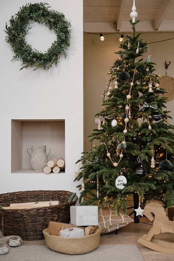
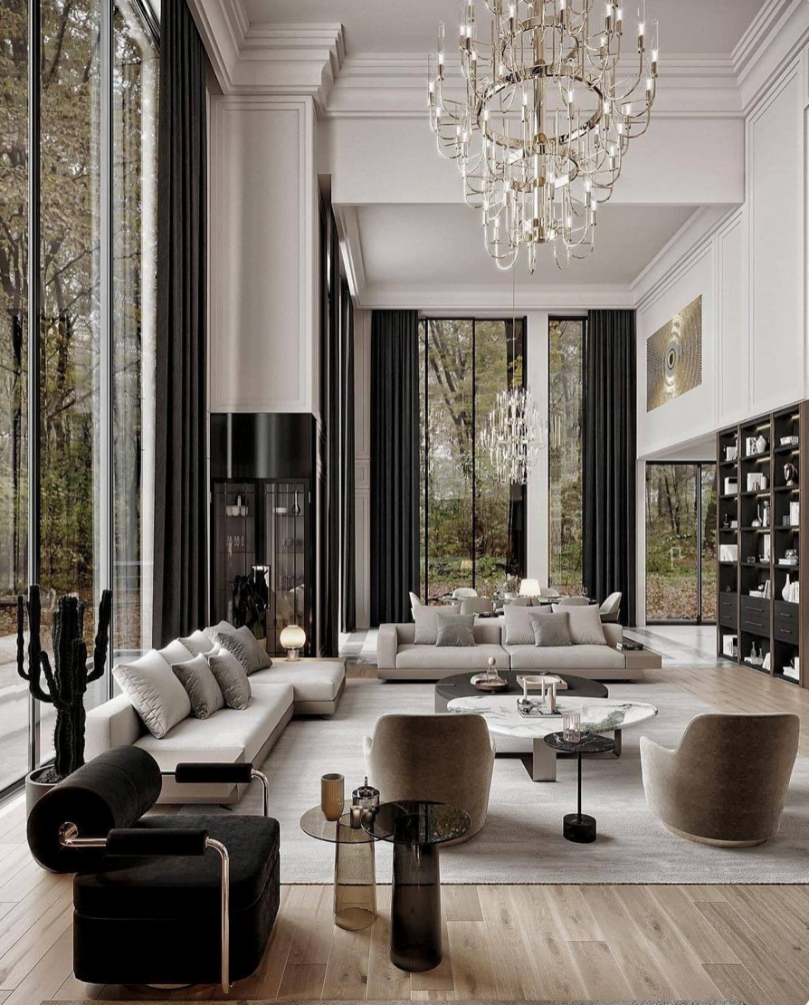
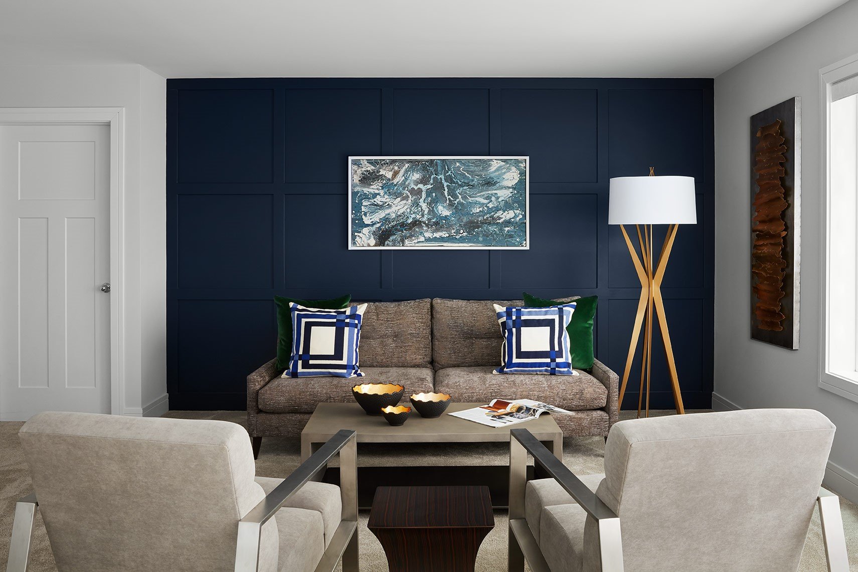
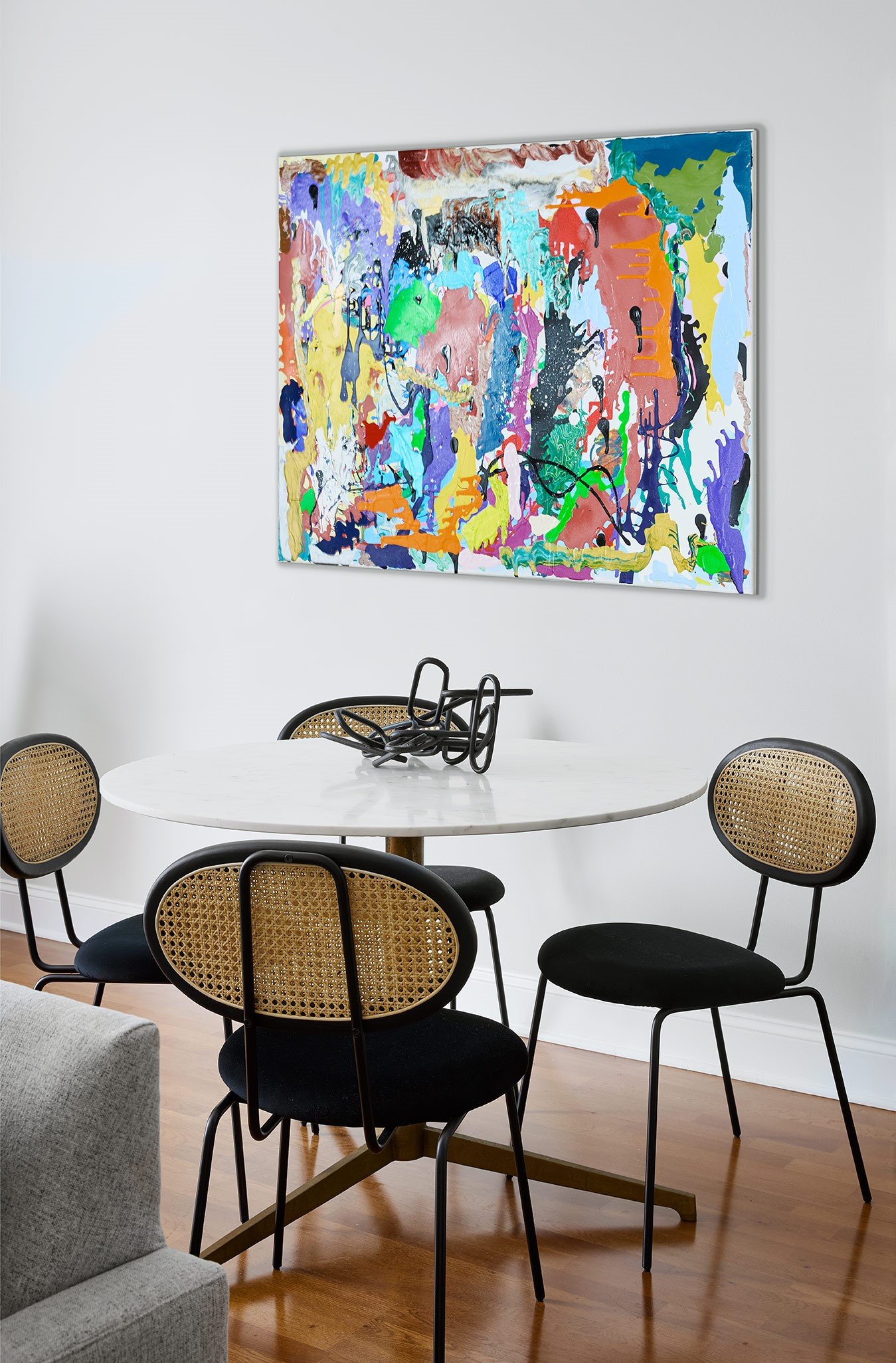
How To Find Your Interior Design Style

PHOTO CREDIT: PINTEREST

Decorating a new space? It can be really helpful to have a foundational understanding of what styles you like in order to pick a direction to go in with your home styling. Personal tastes are a constant evolution, but if you start writing down the things that you love, you’ll be one step closer to finding your design style.

To get started, our Chicago interior designers have compiled a few steps below to help you get a clearer picture of how to best decorate your home. 

PHOTO CREDIT: PINTEREST

What Are The Main Design Styles?

There are many design styles and most homes are a combination of several different ones. Here are some of the most popular interior design styles to have on your radar:

PHOTO CREDIT: PINTEREST

  • Transitional

  • Traditional

  • Eclectic

  • Mid-Century Modern

  • Industrial

  • French Country

  • Modern

  • Bohemian

  • Minimalist

  • Scandinavian

  • Coastal

  • Shabby Chic

Step 1: Look at Your Current Home Decor

PHOTO CREDIT: PINTEREST

Up until now, you’ve likely bought home decor that you’re attracted to without thinking too much about whether it fits into your interior design style. This organic method of collecting pieces can offer a lot of insight into your tastes, so we recommend taking a look around at your furniture, upholstery, and any other decorations that you currently have. Do you have a love of antiques? Or maybe you prefer modern and minimalist pieces? Consider the colors, textures, and shapes that appeal to you most and write them down. You should start to see a pattern emerge of the type of style you prefer.

Step 2: Consider your Fashion Style

Next, look in your closet! We express ourselves through the clothing we wear, so it makes sense to think about your fashion tastes when decorating your home. For example, if you tend to wear a lot of classic, tailored pieces, you will likely be a fan of a traditional or transitional home style. If your closet is filled with bright colors and bold patterns, you’ll likely want to incorporate a lot of color in your home as well. Conversely, if you wear mainly neutrals, it’s likely that you’ll lean towards a more subdued color palette at home.

Step 3: Take Note of Other Homes You Like

Next, drive around town and make a note of architectural details on other homes that catch your eye. If you’re drawn to a modern home, you may find that you appreciate the clean lines, sharp angles and minimalism associated with the style. Or, if instead you’re drawn to a traditional home, you may find that you appreciate rich colors and ornate details in your home design. The outside and interiors of your home should be in harmony, so it’s to your advantage to get familiar with different architectural features.

Step 4: Get Inspired 

You’re probably already starting to get a sense of what style you like, but there is so much more to be inspired by. Our Chicago interior designers are constantly scouring the internet, home magazines, and social media sites like Pinterest, Instagram, and Facebook for new ideas – and we suggest you do the same. You can also take inspiration from your favorite things – whether that is the beach, hiking in the woods, or a hotel you visited in Italy. 

Remember, while we all lean towards one style, your tastes don’t have to fit into a box. Mixing and matching different design elements allows you to create a space that has a naturally collected-over-time feel. Aligning your home style to your tastes not only reflects your personality, but makes your house feel like your home. 

Get in touch with our Chicago interior design firm if you’re having trouble defining your interior design style. We have a variety of services to help bring your home projects to life.

Stay tuned to this blog and follow us on  Instagram here!

Talk to you soon,

Paula

How To Create An Interior Design Budget

PHOTO CREDIT: PAULA INTERIORS

PHOTO CREDIT: PINTEREST

Whether you’re designing your first home or looking to make a few changes to some of your existing rooms, creating a budget will help you determine the overall scope of your design and help keep from overspending. Most people spend between 7-10% of their home’s value on their interior design, but if you are wanting designer finishes, your budget will likely exceed this number. While there are a lot of factors that go into figuring out a budget, we’ve compiled a few steps that will provide the baseline. Once you have an interior design budget in mind, you can get to the fun part of designing your dream concept!

Outline Your Project

The first step to creating your budget is to take into account the area that you will be designing. Think about the size of your space as well as what furniture, fabrics, built-ins and accessories will be needed to create the atmosphere you’re looking for. Certain rooms, like the living room will naturally be more expensive because of the amount of furnishings required. We can help with outlining exactly what we suggest to invest in and which areas you are able to save a little money. For example, you should always invest in a high-quality sofa that can stand up to everyday use.

PHOTO CREDIT: PAULA INTERIORS

Determine Your Priorities

PHOTO CREDIT: PAULA INTERIORS

When it comes to creating an interior design budget, it's important to determine what’s most important to you. Quality, style, and timing are all factors that will determine the cost of your project. You want to ensure that the products you purchase are of the highest quality and will last for years to come, but you may or may not want designer items. Style should be an important factor as well, as you will be living with the design for many years. Your timeline should also be taken into consideration - how quickly do you need the project completed? 

All of these factors will affect the budget for your interior design project, so it's important to weigh them carefully when making decisions about what to buy. Your priorities might also include more expensive items like original artwork and smart home technology. Make a list of your non-negotiables and the items you are willing to let go if need be.

Do Your Research

If you are working with an interior designer, they will do a lot of research for you in finding the best prices for the highest quality decor for your home. However, it also helps if you send ideas of furniture and accessories you find online that are in keeping with your design tastes. By looking around at different vendors’ websites, you’ll be able to piece together an idea of how much items cost. Keep in mind that interior designers are often privy to trade prices, which means that you can actually get a better deal on furniture and home accessories through them than you would on your own.

Consider Service & Shipping Costs

Unless you are doing the entire design yourself, there will be service fees – from your interior designer cost to the installation costs. You should also keep in mind the cost of shipping and handling, which can be high when dealing with large pieces of furniture and art. Particularly if you are in a hurry to get the project done, your interior design fees can add up quickly. Fees for Chicago interior designers vary, so it’s important to look at previous projects they have done and make sure your vision aligns with their aesthetic and experience.

Leave Wiggle Room

When creating your interior design budget, it's important to leave room for the unexpected. Having a contingency fund in place will help protect your budget from potential overruns and unexpected costs. Many people end up going over budget when designing a home, so it’s best to be prepared by factoring in an extra 15-20% of your overall budget as the contingency fund. This is money that you set aside to cover any additional costs or changes that may arise during the project.

From a full-scale renovation to simply freshening up a room, creating a budget is a great place to start your home project. Get in touch with any questions – we’re happy to set up a consultation to discuss your options. Our Chicago interior design firm can help you design a space that’s not only within budget, but one that doesn’t look like you had a budget at all!

Stay tuned to this blog and follow us on  Instagram here!

Talk to you soon,

Paula

Setting Up The Ultimate Festive Bar Cart For Entertaining

Taking holiday entertaining to the next level, bar carts have become very popular with Chicago interior design firms as a stylish furniture piece in the living room, office or dining room. Not only does setting up a festive bar cart keep guests happy, but it also adds sparkle and sophistication to any home. 

As we prep for the New Year and all the exciting times ahead, now is the perfect time to invest in a bar cart. Whether you prefer a sleek Art Deco cart, a casual rattan cart, or a simple wooden cart with wheels, these are our favorite bar cart ideas to make the most of your upcoming celebrations.

Choose a Theme

Hosting a holiday or birthday party? You might want to select a theme for your cart that will add to the festive mood. For example, a New Year’s bar cart might include mirrored trays, gold and silver-rimmed champagne glasses and ‘Happy New Year’ napkins. Deciding on a theme will help your cart feel cohesive as it ties in with the fashion and event decor of the evening.

Wine, Spirits, or Non-Alcoholic?

Once you’ve decided on your theme, it’s time to choose what you’d like to serve… Wine, champagne or a signature cocktail are the most popular options. If you’re serving a mixed drink, we recommend using a dispenser for cocktails to make serving easy. You could also put out a variety of spirits and mixers like tonic water, club soda and cranberry juice to let people decide what they would like to drink. Or, if you want to go the non-alcoholic route, hot chocolate or coffee in the winter and lemonade in the summer are always hits. Don’t forget the garnishes! Depending on the season, you might top off your drinks with classics like lemon and lime wedges and olives or more exciting ingredients like edible flowers, marshmallows, and cinnamon sticks. Be sure to offer a mixture of drink options so that everyone - from wine lovers to mocktail drinkers - can enjoy the festivities!

Stock the Essentials 

Once you’ve decided what you’ll be serving on your cart, it’s time to gather your bar tools and glassware. Start off with a few must-have bar tools such as a jigger, bottle opener, corkscrew, strainer, and plenty of napkins. Depending on what type of drink you are serving, you might need glassware such as wine glasses, highball glasses, lowball glasses, shot glasses, and even mugs. Once you have all the basics covered, consider adding in any specialty items you may need for that specific drink. For example, if you are making martinis, you may want to pick up a shaker and martini glasses. It's also nice to have an ice bucket on hand to keep drinks and champagne cold. With these essentials stocked and ready, you’ll be prepared for anything your guests can throw your way!

Use Risers for Levels

When setting up your bar cart, one of the best ways to make it look attractive and add additional space is to use risers. Risers allow you to create different heights so you can group bar tools, glasses, and drinks separately. Your risers can be anything from cake stands to a stack of books – it’s more about the balancing of high and low than the riser itself. Don’t miss this opportunity to create a statement-making display.

Finishing Touches

As a finishing touch, Chicago interior designers will always recommend some artful accents. While you may already have decorated your cart according to a theme, take a look once you’ve set up your drinks to see if there is leftover space to indulge some more bar cart decor ideas. You don’t need to crowd the cart, but adding some flowers, a small lamp, a candle, or some sculpture can bring everything together. Of course, you can always opt to add a cheese board or bar snacks to your cart as well.

Now that your bar cart is all set up, it's time to enjoy being a great host! Whether you’re having a small gathering of close friends or throwing a large party, your holiday bar cart will serve as a focal point of the evening. Plus, with all your drinks an arms-length away, you’ll be able to enjoy the party without having to run back and forth to the kitchen every minute.

Stay tuned to this blog and follow us on  Instagram here!

Talk to you soon,

Paula

PHOTO CREDIT: PINTEREST

PHOTO CREDIT: PINTEREST

PHOTO CREDIT: PINTEREST

PHOTO CREDIT: PINTEREST

How to Use Color to Create Balance in Your Home

PHOTO CREDIT: PAULA INTERIORS

PHOTO CREDIT: PAULA INTERIORS

One of the most important tools in transforming a space, color has the ability to shape the aesthetics and bring personality to your room. It has can energize you and put you in a positive mood, or it can make you feel relaxed and at ease. Whether you prefer a bold and bright look or a minimal balance of black and white, there is no denying the power of color.

Our Chicago interior designers have compiled this guide of living room color ides to help you decide which colors and what quantities you’ll need to make your home feel balanced.

Consult the Color Wheel

PHOTO CREDIT: PAULA INTERIORS

To master the following living room color ideas, we recommend having a color wheel handy. The color wheel is an indispensable visual tool that displays colors in relation to one another. The foundation for the wheel are the three primary colors, red, blue, and yellow, which are equidistant from one another. All of the colors in between these three can be created by combining them.

Triadic Scheme

If you love lots of color and aren’t afraid of making a powerful statement with your decor, then a triadic color scheme is perfect. It involves using three colors that are evenly spaced on the color wheel, ensuring that no one color overpowers the other two. Triadic color schemes should be bright and eye-catching without being overwhelming. For example, we recently designed a beautiful and artistic garden-themed bedroom with a pink, turquoise and yellow motif. By incorporating these three hues into the artwork, bedspread, and wallpaper, this triadic color scheme brought the feminine room to life.  

Analogous Scheme

More soothing than a triadic color scheme, an analogous scheme uses colors that are next to each other on the color wheel. For example, we recently designed a nursery using light peach, orange, and gold. These analogous colors create a soft contrast that is calming to the eye, which is perfect for a newborn’s room. 

Monochromatic Scheme

Monochromatic may refer to one color, but it’s not as simple as that in an interior design scheme. Instead, a monochromatic scheme refers to using a combination of many different shades, tints and tones of one color. There are various ways you can use this scheme, from creating a cocoon-like bedroom of whites and creams to a jewel-like powder room with shades of green. Just remember that when sticking to a monochromatic palette, you’ll need to incorporate unique textures and layers to add dimension to your room and make it feel exciting.

Follow the 60-30-10 Rule

Now that you’ve chosen the two or three colors you’d like to use, it’s time to decide which you’d like to be your main color and which two will support. The 60-30-10 rule is commonly used in interior design to make sure your room isn’t overwhelming with too much of every color. The numbers correspond to the percentages of each color that you should use – 60% for the main paint color for living room, 30% for the next and 10% for your accent color. You don’t always have to follow this rule, but it is a good jumping off point if you aren’t sure how much of each color to use.

Don’t Forget Your Lighting!

Finally, don’t forget that lighting plays an important part in the appearance of color. You should look at color samples in both natural and artificial light sources at different times of the day to fully get the sense of what your room will look like. 

Here at our Chicago interior design firm, we believe in color’s ability to bring a room to life. Whether you’re switching up artwork, reupholstering furniture or starting a design from square one, these ideas for room colors will help you achieve a balanced color palette. Be sure to browse our most recent projects to get a better look at how we have used color recently.

Stay tuned to this blog and follow us on  Instagram here!

Talk to you soon,

Paula


Home for the Holidays: Revamping Living Areas for Entertainment

PHOTO CREDIT: PINTEREST

The excitement of the holidays is here, which means plenty of chances to entertain at home. When it comes to hosting guests, it’s important to both ensure that they feel at ease and have a great time in your home. From hanging holiday decor to creating cozy seating arrangements, there are lots of simple living room decor changes that can elevate the mood.

As one of the leading Chicago interior design firms, we stand by these living room ideas to foster a fun, sociable environment over the holidays.

Get Organized

Before you can assess what needs to be changed in terms of living room decor, it’s essential that your space be clean and tidy. When you’re busy over the holidays, it’s easy for things to start to look cluttered, which is why having great storage solutions can do wonders for the look and feel of your living area. Get ahead of the problem by upgrading your shelving or adding a few storage cubes, a storage ottoman, or some decorative baskets. 

Light Up The Room

PHOTO CREDIT: PINTEREST

In the darkest nights of the year, lighting can be a powerful tool in creating an inviting atmosphere. A candlelit space is perfect for a dinner or movie night, while bright lights will make your party feel energetic. When choosing what types of lighting you’ll need, consider what activities you'll be doing and how you’d like people to feel. In general, we prefer layered lighting with multiple sources of light, including lamps, recessed lighting, sconces, chandeliers, and candles. Having plenty of lighting options allows you to try out different amounts of lights to see which works best for the occasion.

Rearrange Seating

PHOTO CREDIT: PAULA INTERIORS

The best part of entertaining is enjoying the company of your guests. When you're planning your holiday celebration, think about how you can make guests feel more comfortable. One way of doing this is to rearrange your seating arrangement so that chairs and sofas are closer together to facilitate easy conversation. It’s best to set up several smaller areas rather than one large open seating arrangement. Having a few stools around is a good idea in case you end up needing additional seating.

Add Soft Furnishings

PHOTO CREDIT: PINTEREST

For a quick and easy way to warm up a room, try adding some soft throws to your sofas and laying down rugs on bare floors. These soft furnishings not only look cozy, but they are a practical way to make sure all of your guests are comfortable and warm. Throws made from materials like cashmere, fleece, and velvet are a big hit on chilly nights, while textural rugs like the ones we used in a recent Lincoln Square living room design add visual interest to the room. Using two rugs in an open room can also help delineate space between dining and living areas.

Bring The Outside In

Instead of buying all of your holiday decor, take a look outside first at what nature has provided for you. For example, you might be able to decorate your Christmas table with pinecones and evergreen branches found in the yard. Berry branches also look festive when added to floral arrangements. This fresh touch of natural elements will instantly make your space feel more festive and cozy.

Set Up A Bar Cart

Finally, don’t let your guests go thirsty! While you are cooking the big meal, give them the option to refill their glasses from a luxe bar cart, like the one we used in a recent living room design in Lakeview. Your bar cart or cabinet can be stocked with glasses, barware, liquors, or even a pre-mixed drink in a pitcher. You can even turn your bar cart into a hot chocolate and dessert bar after dinner.

While these living decor ideas seem small, they can make all the difference when it comes to entertaining. Creating a beautiful, warm environment for your holiday parties will not only ensure that people have a great time, but you’ll be able to enjoy the set up all winter long. If you're feeling stuck on what to do, don't be afraid to reach out for advice from our Chicago interior designers. Happy hosting!

Stay tuned to this blog and follow us on  Instagram here!

Talk to you soon,

Paula


Formal Vs. Functional Dining Room Ideas: Which is Right for Your Home?

PHOTO CREDIT: PAULA INTERIORS

PHOTO CREDIT: PAULA INTERIORS

PHOTO CREDIT: PINTEREST

PHOTO CREDIT: PAULA INTERIORS

Formal or functional: how do you prefer to dine at home? While formal dining rooms have been a mainstay in American homes for centuries, they are falling out of favor as many modern families prefer open-plan living with multifunctional spaces and casual aesthetics. Of course, for those who love to host dinners, there is nothing that can replace a formal dining room with a large table that seats all of your guests. 

These two types of dining rooms are at opposite ends of the spectrum, but that doesn't mean one is better than the other – it all comes down to what you need and want in your home. To help you decide which is right for you, our expert Chicago interior designers have compiled some of the main factors that distinguish formal and functional rooms. We hope these dining room ideas inspire you to create the perfect space for your family to relax, laugh, and eat together.

Purpose

The most important consideration in a dining room design is the intended purpose of the room. A formal dining room is typically only used for dining and special events. By comparison, a functional dining room is used for many different activities beyond eating. For example, it might serve as a homework station, gaming table, or place to chat and watch TV after work. Often an extension of the kitchen or living room, functional dining rooms are better for quick meals eaten solo, while formal dining rooms can support a large party.

Furniture & Decor

With its elegant decor and traditional atmosphere, a formal dining room typically features formal furniture like a table and chairs, sideboard, console, and china cabinet. A traditional dining room table should seat between 8-12 guests. Functional dining spaces, on the other hand, can be much smaller and have more casual dining room decor. Some might seat as few as four people, like this recent breakfast nook we designed for clients in LaGrange, Illinois. When it comes to the chairs for your dining room, armchairs are frequently found in formal dining rooms whereas armless chairs are often found in functional dining rooms. The use of a rug beneath the table is very popular in a traditional dining room. 

Lighting

Getting the lighting in your dining area perfect is key to creating an enjoyable ambiance. When choosing fixtures, it is important to take into account factors like the size of the room, mood you want to create, and how much light will be coming in from windows. To make it easier on yourself, consider the types of activities that will happen in your dining room.

In a formal dining room, your lighting doesn’t need to be powerful. Many traditional rooms feature an elegant statement chandelier or sconces that provide enough of a glow for you to see your food without being overly bright. However, as functional dining rooms are often used for multiple purposes, you’ll likely need layered lighting. This could include recessed lighting in addition to a chandelier or pendant lights.

Table Settings

Keep in mind that formal dining rooms typically have a lot more going on with table settings than functional ones. Often, you’ll find china tableware and sterling silver cutlery in a formal dining room along with tablecloths and cloth napkins. A formal dining room table likely has a centerpiece – either a floral arrangement or candles, or both! At a functional table, keeping things simple with everyday ceramic plates and woven or cloth placemats is far more popular. 

When deciding between formal or functional, what matters most is what you need from your dining space. If you live in a smaller house and have more casual dinners, consider going with the more functional option. However, if you have a spare room and know that you love to host dinner parties, we recommend setting up a formal room that feels special when entertaining guests. As one of the leading Chicago interior design firms, we would be thrilled to help you design the dining room of your dreams. Give us a call today to set up a consultation!

Stay tuned to this blog and follow us on  Instagram here!

Talk to you soon,

Paula
A Guide to Arranging Art at Home

PHOTO CREDIT: PAULA INTERIORS

Whether you’re designing your new home or looking to refresh your space, art is a beautiful way to add visual interest and make your space feel more personal. Enhancing a room can be as simple as displaying some paintings, photographs, and art objects that you have selected over the years. As one of the only Chicago interior design firms who specialize in artistic interior design, we’ve created this guide to explain how we place artwork. 

Consider Size 

The size and shape of your artwork are very important factors to consider when deciding where to place it. A good rule of thumb is to leave breathing space that is around 3/8 of the width of a work on either side. A work that is too large for a wall will end up looking cramped, while one that is too small will get lost on a large wall. 

PHOTO CREDIT: PINTEREST

A general rule with the scale of artwork when it is placed over furniture is to choose works that are around ⅔ the size of the furniture, as we did in our recent design of a home in Logan Square. Sometimes even a small wall space can be the perfect spot for a work, adding a unique and unexpected accent. When in doubt, experiment by holding up different pieces on the wall to see how they look before you hang them. Remember that you can also lean small works of art on shelving and your mantel.

Coordinate Colors

PHOTO CREDIT: PAULA INTERIORS

Wanting to infuse your room with some color? Art is a fantastic way to add dynamism and beauty by adding a burst of color. We often use art as a way of bringing in the accent colors of a room, coordinating with accessories like draperies, pillows, or rugs. Of course, if you have a black and white photograph or minimalist work, it can add a point of contrast to your surroundings by bringing a modern feel.

Create a Grouping

If you have a large wall and many smaller works, you can create a statement grouping that will become a focal point of your room. The grouping should have a unifying element, whether color or theme. We recommend laying out your grouping on the floor first before trying to hang so that you can move the works around to see what looks best. Start by placing the largest works first and then arrange the smaller works, keeping symmetry and an equal amount of spacing in mind as you do. An asymmetrical grouping, like this one will come across as more modern, while a symmetrical arrangement is more traditional. 

PHOTO CREDIT: PINTEREST

Hang Art at Eye Level

You should always aim to have the center of your artwork at eye level. Many people make the mistake of hanging artwork too high, which can make the works feel like they are floating. The only time a work should be above or below eye level is when it is hung above specific types of furniture. For example, if you are hanging a large work above a sofa, it should be hung just high enough to not touch the tops of people’s heads when they are sitting.

Measure Your Wall

Ready to start hanging? To make sure you drill your hole in exactly the right spot, it’s necessary to measure both your wall and the artwork. You can either mark the spot where you are going to drill with a pencil or cut out kraft paper in the size of your artwork and tape it to the wall using painter’s tape to make sure you have the right spot. This technique is especially beneficial if you are creating a grouping of works. Use a level to make sure that the top edge of your kraft paper is straight before you tape it up. 

Arranging art on walls in your home can be a great way to add some personality, creativity and color to your space. The best part about hanging a picture is that there are no hard rules; go ahead and experiment with different arrangements to see what works for you. If you need any help, reach out to our Chicago interior designers for advice on hanging your home wall decor. Every work deserves a special spot where it can be appreciated !

For more cutting-edge tips and dashing designs, stay tuned to this blog and follow us on  Instagram here!

Talk to you soon,

Paula

A Guide to Layering Texture in a Room

PHOTO CREDIT: PINTEREST

Color, light, and space are critical design elements that can transform your home, but they aren’t the only important factors. Texture is often overlooked, but it is equally as important to creating depth and a sense of comfort and warmth. Too many of the same materials can result in interiors that feel sterile or overwhelming. There is an art to adding visual interest, which is best achieved by layering different textures throughout your space.

PHOTO CREDIT: PINTEREST

Here’s how our Chicago interior designers balance out textures from the floors to the ceilings. 

Floors

The floor sets the tone for the room, so it’s important to decide early on how you want it to come across. Do you prefer sleek hardwood floors, plush carpeting, or a mixture of hard and soft elements with layered rugs? There are many types of textural rugs to choose from, including ones made of natural fibers like jute and sisal, which give off an organic feel. Or, you could choose a plush hand-knotted rug that has been intricately woven to create a work of art on the floor. Everyone will notice your floors as soon as they step inside, so make sure they are in keeping with your design aesthetic.

Walls

PHOTO CREDIT: PINTEREST

When it comes to the walls, you have infinite choices to create textural magic. While painted walls are a popular choice, they don’t do much more than add color. Instead, try adding texture with special effect wallpaper that feels like velvet or cork, or one with raised prints. Unique wallcoverings can give a space a sumptuous feel, but be careful because your guests won’t be able to resist touching the walls! If you have the luxury of a brick or stone fireplace, you can design the room around this statement element. You can also add texture with artwork – from an oil painting to a beaded wall hanging. Instead of choosing 2D prints, opt for something with a bit more dynamism and you’ll be amazed how it brings your walls to life.

PHOTO CREDIT: PINTEREST

Soft Furnishings

The easiest way to layer texture in a room that has already been designed is to switch out some of the soft furnishings like pillows, throws, and bedding. While all of these provide an element of texture, there are certain fabrics that will make more of an impact than others. For example, boucle, chenille, and tweed all have a chunky weave that creates a thick, textured effect. Or, a faux-fur rug or throw adds instant charm and coziness for the fall and winter. 

Upholstery 

You can also use upholstery to add texture to furniture. For a recent project in Chicago, we pulled together furniture with contrasting textures to match the modern, artistic design of the breakfast room we were designing. On the floor, we laid a fuzzy, colorful rug, which supported a sleek white tulip table. We added a sofa upholstered in a soft woven material as well as two chairs covered in black faux alligator skin as the seating around the table. While these items share very few similarities, they work together to create a maximalist space that you won’t find elsewhere.

Home Accents

Finally, add some hard and soft textured home accents to create a collected-over-time feeling in your space. Mirrors with ornate frames, plants, books, and baskets are all examples of textural accents that can add excitement at home. In the kitchen, you might try woven placements with tasseled napkins and wooden bowls – complementary textures create an inviting table. You can even add texture with a statement light fixture, like this one, which hangs above a dining table.

How you layer texture in a room will ultimately depend on what look you are trying to achieve. Many Chicago interior design firms specialize in modern design styles where they layer hard textures like matte metals with stone countertops to make spaces feel edgy and sleek. However, if you want your textured room to feel rustic and cozy, you would need to layer natural fibers like wool and leather with more rustic metals like copper to bring out the warmth in the room. The key is to consider how these materials will look together and strike the right balance between variety and cohesion.

For more cutting-edge tips and dashing designs, stay tuned to this blog and follow us on  Instagram here!

Talk to you soon,

Paula

Look Up: Statement Ceiling Ideas to Try

PHOTO CREDIT: PINTEREST

When was the last time you walked into a room and looked up right away? People often forget that the ceiling is the fifth wall in a room and one that can make a big impact when it comes to the overall atmosphere. Ceilings provide an opportunity to be experimental with color, patterns, and textures that draw the eye up and set the tone for the room. 

Take your ceilings to new heights with these creative ceiling ideas.

PHOTO CREDIT: PINTEREST

Colored Ceiling

Ceilings painted in colorful hues are a great way to inject some personality and interest into any room. Whether you want to add an invigorating pop of color like bright yellow, create a sense of calm with warm brown, or add a luxurious touch with gold, a colored ceiling creates a focal point for the room. A light blue paint is particularly beautiful for ceilings as it is reminiscent of the sky outside.

Wallpapered Ceiling

One of our favorite bedroom ceiling ideas is to use wallpaper, either with a graphic or a botanical print, to create an artistic effect. In a recent master bedroom project in Chicago, we used a graphic print wallpaper to transform the wall and slanted ceiling within a closet into a design-forward reading nook for our clients. Note: Wallpaper on a ceiling works best in small spaces where it won’t be overwhelming.

PHOTO CREDIT: PINTEREST

Coffered Ceiling

One of the most ornate ceiling designs, coffered ceilings feature molding that comes in the shape of recessed squares or rectangles. This elegant ceiling style is often found in formal spaces, but it can be used in any room of your house to create a stunning and luxurious ambiance. 

Skylights

If you’re looking for vaulted ceiling ideas, the addition of skylights can create a truly serene space. Bring the outside in by installing skylights that let natural light stream into your room from above. Not only do skylights eliminate the need for artificial light during the day, but they make the room feel more expansive and bright. 

A Glossy Effect

While most ceilings are painted in a flat paint to hide imperfections, there are some benefits to using paint with a high level of sheen. Glossy painted ceilings reflect a lot of light, which makes a room feel larger. For small rooms, you can paint both the walls and the ceiling with the same high-gloss paint for a jewel box look.

Unique Light Fixtures

Finally, if you are looking to enhance your space without making major changes, you can install a unique light fixture that will catch the eye. In a bedroom or dining room, you can add a large chandelier, flush light fixture or semi-flush light fixture to enhance the beauty of your room and provide soft lighting. From crystal-adorned chandeliers to brass fixtures with an industrial feel, unique light sources add drama and glamor to any space.

It’s no secret that ceilings are often overlooked when it comes to decorating, but they are a great way to make your rooms stand out while showing off your unique style. Whether you’re using a bold color, patterned wallpaper, or the addition of skylights or light fixtures, you can make an impact with these creative ceiling ideas at home.

For more cutting-edge tips and dashing designs, stay tuned to this blog and follow us on  Instagram here!

Talk to you soon,

Paula

The Lasting Appeal of Mid-Century Modern Design

PHOTO CREDIT: PINTEREST

PHOTO CREDIT: PINTEREST

Credited with being the first modern style of design, the mid-century modern movement referred to the interior design, graphic design, and architectural style that emerged after WWII. At this time in the United States, the economy was on an upswing, which led to a boom in the housing market and lots of new, creative ideas that would shape the future of design. While the movement was coined in 1984 by journalist Cara Greenberg, it began in the mid-1940s and hit peak prominence in the 1950s and ‘60s.

Moving away from the heavily ornamental interiors of previous decades, the mid-century modern style is known for its emphasis on functionality, clean lines, bright colors, and geometric patterns. While many design trends come and go, mid-century modern has recently had a big resurgence that proves it’s here to stay for good. 

Let’s explore why mid-century modern interiors will never truly go out of style.

Clean Lines and Mixed Materials

PHOTO CREDIT: PINTEREST

Minimalism is a pillar of the mid-century modern movement and you’ll find an emphasis on simplistic lines and geometric shapes similar to Scandinavian design. Instead of lavish accents and trinkets, mid-century modern interiors are clean and functional with large, streamlined sculptural pieces rather than lots of small art pieces. When it comes to materials used in the rooms, there is a mixture of manmade and synthetic materials like wood, metal, leather, glass, and acrylic. This was a time of paring back aesthetics while also experimenting with new materials that had become available after the war.

Adaptable Furniture

Highly versatile and adaptable, mid-century modern furniture was designed to be multipurpose and suited to any size room. The emphasis was always on practicality – clean lines with no extra bells or whistles. The usability of these furniture pieces was groundbreaking. Never before had chairs, tables, and desks been designed to be used in any room throughout the home or office. From the iconic Eames Lounge Chair to Arne Jacobsen’s Egg Chair, the functional and funky creations that came out of this period are far too good to fade into design history.

Bold, Striking Colors

There is an inherent playfulness in mid-century modern decor, seen most noticeably in the color palette and patterns of the era. While neutrals and earth tones were popular choices, pops of bright, retro primary colors like red, yellow, and blue were hallmark to the movement. They helped to create a lively atmosphere for a new era of post-war Americans to come home to. This commitment to vibrancy is still attractive today, and we frequently use pops of color along with retro accents in our projects, like this mid-century modern living room

A Touch of Nature

PHOTO CREDIT: PAULA INTERIORS

You’ll find a lot of organic elements in mid-century modern home design, starting with the architecture of the homes. Many mid-century modern homes were designed to blend with their surroundings and feature large, unobstructed windows that allow for beautiful views of the landscape. These home often featured open floor plans that would allow the rooms to seamlessly flow from the interior to the exterior. When it comes to decor, it’s all about creating a sense of harmony with the outdoors. You’ll almost always find a potted plant or two present in a mid-century modern living room.

When it comes to interior design, there are certain styles that never go out of fashion. Thanks to its timeless appeal, mid-century modern design has experienced a resurgence in popularity in recent years and proved its staying power. Whether you prefer a more minimalist approach or enjoy a pop of color, mid-century modern interiors are adaptable to a variety of different tastes.

For more cutting-edge tips and dashing designs, stay tuned to this blog and follow us on  Instagram here!

Talk to you soon,

Paula

How to Bring Warmth to a Neutral Color Scheme

PHOTO CREDIT: PINTEREST

In recent years, neutrally-toned rooms have been growing in popularity as people seek more restful, cozy retreats from the modern world. Not only is a neutral color palette highly versatile, but it can create a sense of calm and serenity with a visual appeal that’s easy to live with on a daily basis. While too much white can come across as drab or sterile, the right balance of layered hues, textiles, and light can create blissful neutral spaces and a welcoming home environment. Remember, your space should be muted, not silent.

Layer Warm Neutrals

PHOTO CREDIT: PINTEREST

Instead of opting for cool grays and true whites, we like to use various earth tones to bring a sense of warmth to a room. Layering different shades of neutral colors on the walls, ceiling, floors, and upholstery creates depth and interest, rather than having everything be the exact same color. For example, in a recent home office project, we used shades of tan and brown to create a warm and inviting nook where productivity will surely soar.

Emphasize Natural Light 

Paying attention to lighting is really important to create an inviting space, rather than one that feels like a hospital or office building. Instead of blocking out the windows with thick drapes, we prefer to use floor-to-ceiling sheer curtains that provide privacy without blocking the light. Keeping the windows unobstructed allows warm natural light to flood in. You can also hang mirrors on the walls to reflect light and make a space feel brighter and more welcoming.

PHOTO CREDIT: PINTEREST

At night, use warm light fixtures with incandescent bulbs that emit a yellowish light, rather than using harsh fluorescent overhead lights. Another option is to use string lights or candles to create an inviting glow. Finally, installing a working fireplace can add that extra cozy ambiance in a room.

Add Organic Textures

While sleek surfaces can give off a cold aesthetic, textural accents like woven artwork and wood floors add life and dynamism to a space. Using natural materials like rattan, jute, wool, and stone adds dimension while bringing the outside in. The stronger the contrast between textiles, the more comfortable and welcoming a space will feel. Metallic accents, like the gold tables in this calming living room can also add a bit of eye-catching shine that will enhance a neutral color scheme.

Avoid Harsh Edges

When you are working with a neutral color palette, it's important to make sure that your furniture works with the pared-back aesthetic. We often use sculptural furniture with organic shapes to add a touch of softness to a room. Not only does a neutral color scheme provide the perfect backdrop for more dramatic furniture shapes, but the curved lines help to create a more inviting space that you will actually want to sit down in.

A neutral color scheme doesn't have to be cold or minimalist, in fact, it can be very stylish as well as timeless. By using different textures and playing with light and layering, it’s possible to create a warm and inviting space that everyone in the family will enjoy. With a little bit of creativity, any room can be transformed into a cozy retreat with neutral colors.

For more cutting-edge tips and dashing designs, stay tuned to this blog and follow us on  Instagram here!

Talk to you soon,

Paula

Color Blocking: Making a Bold Statement at Home

Photo Credit: Pinterest

In recent years, color blocking has become a really popular technique using two or more solid colors in a room to create a bold visual statement. This simple idea has transcended art, fashion, and interior design, exuding drama with a clean style. While traditional color blocking involved two opposite hues, the definition has expanded to include any and all shades of the rainbow. 

We’ve used color block painting numerous times for clients who wanted a bit of extra flair in their spaces. Here are our favorite techniques to achieve wow-worthy rooms.

1.   Follow a Monochromatic Palette

Photo Credit: Paula Interiors

A monochromatic color scheme uses different tones, tints, and shades of a single hue. To use this scheme idea, start with the color that you would definitely like to use in the room. Now select another shade or two of that same color – they can be lighter or darker. Use that color in lightest shade for furnishings, then add the medium shade to pillows and accessories. This contrast creates much more interest than if the room was all the same hue.

Photo Credit: Pinterest

2.           Create an Accent Wall

Instead of painting all the walls in a room in the same color, consider having just one wall stand out as a focal point. This works particularly well in a smaller bedroom or living room where you have the largest piece of furniture against the wall – it creates a backdrop and actually makes the room feel larger. While one wall will feature a bold color, the other walls can be painted in a neutral shade, like off-white.

Photo Credit: ohjoy.com

We recently worked on color block painting a large master bedroom that featured a navy blue accent wall with gray paint on the other walls. As a finishing touch, we decided to bring in a patterned wallpaper for a cozy reading nook. Not only did this add dynamism to the space, but it brought together all the colors used in the room.

3.           Use Bold Complementary Hues

When you want to make the biggest impact with paint, don't be afraid to go bold with complementary colors. It’s best to start with one color you love and then consult a color wheel to find the hue that is the opposite. Some surprisingly beautiful combinations include pink/green and blue/orange. 

4.           Create Shapes with Paint

For clients who appreciate a bit of whimsy at home, color blocking in a geometric shape can add intrigue and style to their space. For example, one room painting idea is to create a large circle or archway of paint above a bed. This gives the appearance of an elegant frame and even works as a stand-in for a headboard. Other shapes like squares, lines, and triangles can work really well in children’s bedrooms and playrooms, bringing a bit of fun to their walls.

It’s important to remember that color block painting doesn’t stop with your walls. Integrating your chosen colors, whether in subtle or bold ways is essential to creating a cohesive room. While paint can always be changed, it’s best to get things right the first time so that you can start enjoying your room sooner. From furniture to home accents and wall paint, we work to create balanced spaces for our clients, blending function and form to achieve beautiful results.

For more cutting-edge tips and dashing designs, stay tuned to this blog and follow us on  Instagram here!

Talk to you soon,

Paula,

Best Kitchen Lighting Ideas for Functionality and Style

PHOTO CREDIT: BO & DOT

More than other room in the house, kitchen lighting matters. As the heart of the home, the kitchen is a place to cook delicious food and enjoy being with the people you love, both of which require very specific (and different) types of lighting. Not only can light dramatically change the look and feel of your kitchen, but it can make or break the meals you are planning as high visibility is essential when you are cooking. Whether you want to update your current fixtures or are planning on building your kitchen from scratch, these kitchen lighting ideas keep both functionality and style in mind.

PHOTO CREDIT: PAULA INTERIORS

There are three categories of kitchen lighting: ambient, task, and accent. You’ll want a mixture of the three to cover all your bases, creating a layered lighting scheme that meets your exact needs. 

Ambient Lighting

Ambient kitchen lighting provides the overall illumination for a space. This type of lighting primarily comes in the form of ceiling light fixtures like recessed lighting, chandeliers and pendant lights. It works in tandem with natural light coming from the windows to create a bright, yet not harsh ambiance. 

Task Lighting

PHOTO CREDIT: PAULA INTERIORS

If you’re the cook in the family, you know how important it is to have task lighting. It’s how you are able to see what you are doing while you are cooking, chopping, cleaning, and reading recipes. The most common types of task lighting fixtures in a functional kitchen include LED strip lights and undercabinet lighting. 

Accent Lighting

Finally, there’s accent lighting, which is responsible for adding ambiance to your space. Accent lights focus on one particular spot or object, setting the mood without illuminating the entire room. Some popular accent light fixtures include toe kick lights, wall sconces, and track lighting.

Our Most Popular Kitchen Lighting Fixtures 

1.   Statement Chandelier

As a type of ambient kitchen lighting, chandeliers are a great way to add style to your kitchen as well as general light. When choosing a statement chandelier, it’s important to take into account the size of your kitchen and the overall style of your home to keep it from feeling out of proportion. For example, we recently desinged a breakfast nook with a modern chandelier hanging over an intimate table for four. We take careful consideration into the height of hanging light fixtures because they can bump heads when they are too low and lose impact when they are too high. 

2.           Pendant Lights

While chandeliers have many bulbs on one fixture, pendant lights feature just one bulb on each. Recently, they’ve become very popular in contemporary kitchens. One way we love using pendant lights is to hang three over a kitchen island, as we did in this recent kitchen design. They not only add a focal point to the space, but also spread light evenly across an area where you do a lot of cooking and entertaining. 

3.           Wall Sconces

As wall sconces focus light on one specific spot, they can be used as accent lights to set the mood in your kitchen for celebrating. There are endless styles of wall sconces to choose from and we’re always happy to make suggestions for our clients depending on what design style they prefer.

4.           Under Cabinet Lights

Under cabinet lights are popular for task lighting and come in an array of shapes and styles. Some of the most commonly used are circular puck lights, LED strips, and fluorescent bulbs. All of these will light up your countertop areas, making it easier to see what you're doing. 

5.           Recessed Lighting

Used in many kitchens, recessed lighting is installed into the ceiling to provide general lighting for the room. They blend in when not in use, but provide a lot of light at night without being too obvious as a fixture. They’re especially useful when a dimmer switch is installed because it lets you control the strength of the light. 

Good kitchen lighting fixtures are a must-have in any home. Not only do they provide much-needed illumination for cooking and food prep, but they can also be used to create a warm and inviting ambiance for your guests and family. After years of working on both residential and commercial properties, we have the expertise on beautiful, functional lighting solutions for your kitchen.

For more cutting-edge tips and dashing designs, stay tuned to this blog and follow us on  Instagram here!

Talk to you soon,

Paula

What interior design services should I expect from my designer?

PHOTO CREDIT: PINTEREST

Whether you need an interior designer to do a whole house (which may include kitchen and bath) multi-room, or an individual room project, there are certain services you may expect to receive. The same is true for new builds, total renovations, or just a simple refresh of rooms. Here are some services your interior design professional can provide:

Total project management will include:

1. Budget planning and implementation

PHOTO CREDIT: PAULA INTERIORS

An interior designer will help you set a realistic budget for your project and give you budget updates as the project progresses, so you’ll know where you stand at any given time and if you’re keeping within your budget goals. This will allow you and your designer to make informed decisions about upgrades and unexpected purchases.

2. Space planning

PHOTO CREDIT: PAULA INTERIORS

Your designer will be able to show you how your interior space can be used most effectively to ensure that the maximum potential of your room’s square footage is realized.

3. Color consultation

To create your optimal living environment, an interior designer will work with you to choose a color palette that is pleasing to you and brings your interior spaces to life.

4. Purchasing, shipping, installation

Materials, furnishings, and decorative accessories can be sourced by your design professional, from purchasing and shipping to installation--a seamless process.

5. Lighting

You can expect your designer to help you select beautiful and functional lighting fixtures and lamps, plus ensure appropriate placement of all lighting.

6. Additional architectural details

If architectural elements need to be added to your interiors, an interior designer can select (with your approval) elements such as baseboards, decorative molding, and millwork to enhance your home’s existing architecture.

7. Window treatments

From measurements to purchase of ready-made or custom draperies and sheers, custom curtains and/or blinds and their installation, your designer can bring your vision to life.

8. Carpeting and/or area rugs

Whether it’s the installation of new or replacement of old, an interior designer will take care of all the details. And when it comes to finishing touches like area rugs, you can rest assured that color, pattern, and material will be just right for your rooms.

Beyond these services, you can expect an interior designer to have the education and expertise to create kitchen and bath layouts, select the appliances and fixtures to fit your home and your style.

Should you want to bring a tired room back to life rather than totally renovating a space, an interior designer will also offer that service, helping you select new paint colors, a great new furniture layout, new furniture or a redo of pieces you love and new lighting, wall art, and decorative accessories.

Perhaps most important is the peace of mind a trusted professional can bring to your life. By giving you inspiration, guidance, and advice, an interior designer to see your project through from start to finish, from planning to installation, will allow you to relax and enjoy the adventure.

If you are looking for interior design inspiration follow us on Instagram @paulainteriors

Talk to you soon,

Paula

4 Common Renovation Mistakes & how to avoid them

PHOTO CREDIT: PAULA INTERIORS

PHOTO CREDIT: PAULA INTERIORS

The process of planning a home renovation can be very stressful. There are several potential problems along the road, beginning with the selection of the project and continuing all the way through the finishing touches.

Preparation is key when demolishing walls to extend the bathroom or constructing an open-concept main floor. Here's how you can avoid the most typical renovation mistakes.

1.      Have a Clear Vision

Before researching contractors and remodelers, have a vision on how you want the space to feel or look. Changing a project's design might be more complicated. Detailing your vision will also help your contractor or designer. More decisions upfront will lead to more accurate estimates.

2.      Do Not Rush Through Things

PHOTO CREDIT: PAULA INTERIORS

Remodeling your master suite or any other part of the house is exciting, but you'll regret rushing later in the process, which is why it is crucial that you take your time.  Your home improvement won't happen overnight. The design process requires exact measurements and consideration of space functionality. Avoid diving right in to ensure everything is done correctly.

3.      Do Not Hire in Urgency

Yes, that is right. People tend to hire the first contractor that they come across once they quote a price. As per the industrial experts, the price is not the only thing that one should look for while hiring a home renovator, architect, or designer. There are many other things that one should consider, such as the quality of workmanship and the report you have with them. Simply hiring based on the price quote without further evaluation will only result in later regrets.

4.      Stop Being an Idealist

Well, it is true. People at times get idealist when deciding on a budget while completely forgetting the ground realities. Therefore, it is important to set realistic figures instead of lowballing, as it will only decrease the work quality and materials.

The Bottom Line

Renovating your house is a once-in-a-lifetime opportunity. To make things more complex, there are no second chances. Take your time; create Pinterest boards with ideas, get help from designers, contractors and architects that will help you thought the process and will ensure you will have the results you were longing for.

If you are looking for interior design inspiration follow us on Instagram @paulainteriors

Is it okay to Mix Metals to Revitalize Your Home Decor?

PHOTO CREDIT: PAULA INTERIORS

PHOTO CREDIT: PAULA INTERIORS

PHOTO CREDIT: PAULA INTERIORS

Details in designing uplift any space. We rejuvenate homes with the right metal conjugation and drift the most authentic vibes. We use subtle color palettes by typically using dark and light contrasts. We Combine precious metals with rare ones and ultimately spellbind our clients by adding depth to their space.


Does it seem hard for you to pull off your metal scheme in your home space? Try our tricks to hunt the magical look.

Choose a base and theme of your choice.

Foundations have to be strong while dealing with any of life’s cases. The same goes here. A right base will eventually let the metallic and word furniture in your space to stand out. Your metals and wood-based furniture installment are always searching for darker hues, which are easily achieved with darker bases drawn out of antique metal coats. You may even opt for a lighter base and supplement the metal’s top with a darker finish.

Deliberate Mixing of Metals is crucial.

You rather don’t have to seek protocols while letting a metal submerged in the next, but at least pay a bit of attention it deserves. Pick one prime metal and accentuate your mix to brighter and darker focus according to your needs. Contrasts are well achieved by a greater spread of stand-alone metal types while at the same time collaborating effectively to achieve the tone of your choice.

Contrast Visuals

It’s a norm that dark and light tones will better submerge to provide a subtle finish. It’s not true every time! Don’t you think a darker shade will win over the lighter tones in such stand apart mixes? You may choose the same color tones; therefore, warmer tones may be selected as separate entities rather than hanging the cooler tones in. It’s even not expected to overload your space with dozens of metallic mixes. The right blend of two to three metals will tailor the exact space look you ever wanted to achieve.


For more cutting-edge tips and dashing designs, stay tuned to this blog and follow us on  Instagram here!

Why Is It Important To Have A Functional Yet Beautiful Entryway

Photo Credit: Paula Interiors

When it comes to the design of your house, every aspect is equally important. Either it is the storeroom we are talking about or a place that's in front of the eyes like your living room or the entryway.

On the topic of entryways, we are often so held up by other spaces in our house that we forget the importance of their design.

Photo Credit: Paula Interiors

Let's find out why it is necessary to have a practical yet beautiful entryway.

The First Area To Be Noticed

Before someone sees your stylish living room, it's the entryway they'll be going through. Therefore, automatically it's the first that comes to their notice.

Now, your entryway has to be both functional along with eye-catching. When talking about functionality, the entryway will hold storage for shoes, keys, and other important stuff. But you don't want all of these items to be sprawled at the entrance. Therefore, after discussing with your interior designer, design a stylish compartment for all the storage.

First Impression Is The Last Impression

Photo Credit: Paula Interiors

This phrase can't be stressed enough, especially when we are talking about the interior design of our house. The moment a visitor steps into your house, it's the entryway they notice, right?

If this entryway is filled with scattered muddy shoes, what impression will it have on the guests?

A bad one, for sure. It wouldn't matter if your living room is adorned with chic paintings and pieces, a badly designed entryway will ruin the game for you.

It Will Decide The Vibe For Your House

A house is either warm and welcoming or off-putting and cold. There's no in-between. An entryway is one of the most important components when it comes to setting the bases of an environment or aura for your house.

If your entryway has dark walls with no personal items, the visitor may not feel comfortable. On the other hand, if the entryway has a pop of  color  accents, the house will overall represent a friendly vibe.

Therefore, the importance of a put-together entryway cannot be ignored.

Talk to you soon,

Paula 

Why You Should Recommend Paula Interiors For Your Projects

Photo Credit: Paula Interiors

Interior Designers will always have your back. They come with years and years of experience, and nothing can beat experience, right?

The market is filled with such designers but just not all of them hit the right mark. Paula Interiors, however, is not one of them. The list is long when it comes to why people always choose us. Keep reading to find out.

Photo Credit: Paula Interiors

Industry Knowledge

Anyone can claim to be an interior designer. But not everyone has what it takes. And what does it take? Useful and fruitful Industry knowledge and Paula Interiors has just that.

Even though a high-class interior designer doesn't need a designer degree, experience is a must. Paula Interiors comes with years of experience and effective techniques that will allow you to have it all in a place you can call home.

Photo Credit: Paula Interiors

All of this experience and knowledge doesn't only allow the brand to choose the best designs but also the materials and components that will perfectly complement your house, and not everyone has this talent.

Budget-conscious

What makes Paula Interiors special is that they are ready to work respecting your budget. Moreover, the price they quote for their services will be a worthy assessment as all the efforts will be reflected in a chic and aesthetic design of your house.

Usage of High-Quality Products Only

It's not always about deciding on the right designs and choosing the perfect complementing materials. More than half of it lies in the quality.

And high-quality work is the unique selling point of Paula Interiors. All the materials they'll use in the design of your house will be top-tier quality as the brand has access to some of the finest material sources out there.

When you realize that your house can need a bit of revamping, you know who call !

Talk to you soon,

Paula 

Top 4 Storage Solutions For a Practically Aesthetic Interior

Photo Credit: Pinterest

There are times when you'll find your home/room in a constant state of mess with no way out. Whatever you try, it ends up getting messy and disorganized. We have all been there, haven't we?

Well, don't you worry. Here's a list of steps you can take to make sure everything is well-organized and tidy in your home and your room.

Using Drawers for Organization:

Drawers are nothing new. They have been here for centuries evolving and changing designs with time. But they are for sure a valuable thing. One of the most prominent advantages of owning a drawer is that they allow you to store stuff: clothes, gym wear, jewelry, books, etc.

They never go out of style and are a perfect side piece to elevate the look of a room. Hence, if you still are not using them, it's time that you utilize this masterpiece and change the game.

Fold-Down Desks

Photo Credit: Pinterest

Without a doubt, desks take up a lot of space. But they are an important component of organizing your room/house perfectly. So what do you do? You ask your interior designer to help you find out a stylish and trendy fold-down desk.

These desks will be fixed with the wall. The thing with fol down desks is that they are accommodating and will only be used when you need them, not taking up any unwanted space.

Flexible Furniture

Furniture that has multiple uses is going to be the one for you. The market is filled with such pieces. For instance, you can convert from seating 6-person dining table to 8. Console tables can serve as bars, ottomans can be used for extra seating. Etc.

Photo Credit: dshoppe.com

Baskets

One can never have enough baskets. You need it to store your laundry, the never-ending pile of socks, tops, and whatnot. Choose a basket that's pretty and aesthetic. After filling up the basket, you can even throw on a bit of blanket to cover the whole thing up.

The above-mentioned ideas are easy to follow and mighty effective. However, if you want to make a permanent change, it's always recommended to hire an interior designer and get a home makeover. It's always better in the long run.

Talk to you soon,

Paula 

Facts About Interior Designers

Photo Credit: Paula Interiors

Did you ever find yourself curious about how your interior designer gets inspired and changes the whole game?

What's so special about them and their work that blows your mind away and leads to your house is one of the most stylish ones out there? Well, we got all the answers.

Stick till the end to find out never-heard-before facts about interior designers and what they have to offer.

Make All the Decisions for You!

Interior designers are like genies. They will make your wishes come true. It's not an exaggeration. The main task of interior design is to give life to your vision. Hence, they tend to take all the decisions to help achieve that goal on your behalf.

Photo Credit: Paula Interiors

Interior designs have a never-ending list of ideas, and their brains are filled with inspiration. At the end of the day, the final decision will be yours, but for the most part, interior designers will be the ones aiding you throughout the whole process.

Expertise Comes At a Certain Cost!

The work of an interior designer requires creativity and utmost passion. It's not the work of an ordinary man. Neither can everyone do it?

Therefore, when the work is high-quality and comes with great responsibility, it will not be a cheap option. The same goes for interior designers. They tend to be expensive, and this high cost is pretty justified.

Photo Credit: Paula Interiors

Trend Followers

One of the things that are guaranteed when working with interior designers is that your house will for sure be a trendy one. It will not be outdated.

This is because interior designers believe in trends. They keep up with them. It's their job. And hence you'll have for yourself a trendy house but the one that caters to your needs.

So, how many of the above-mentioned facts did you not know? Interior designers are the backbone of a well-designed house. It's crucial that you know about them, their task entails, etc.

 Talk to you soon,

Paula