Color Drenching: All About this Bold Interiors Trend

Lately, the interior design world has been embracing floor-to-ceiling color and we couldn’t be more on board with it! Here at Paula Interiors, our passion for bold color, patterns, and artwork aligns perfectly with this latest craze, called color drenching. Whether you’re in the mood for daring burgundies or gentle cloud greys, let’s explore why this trend is so popular and how you can incorporate it into your own home.

What is Color Drenching?

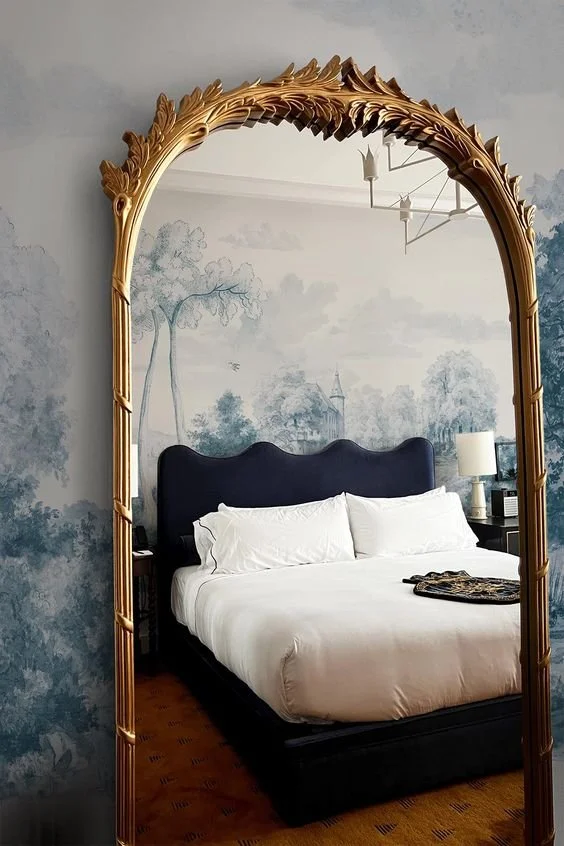
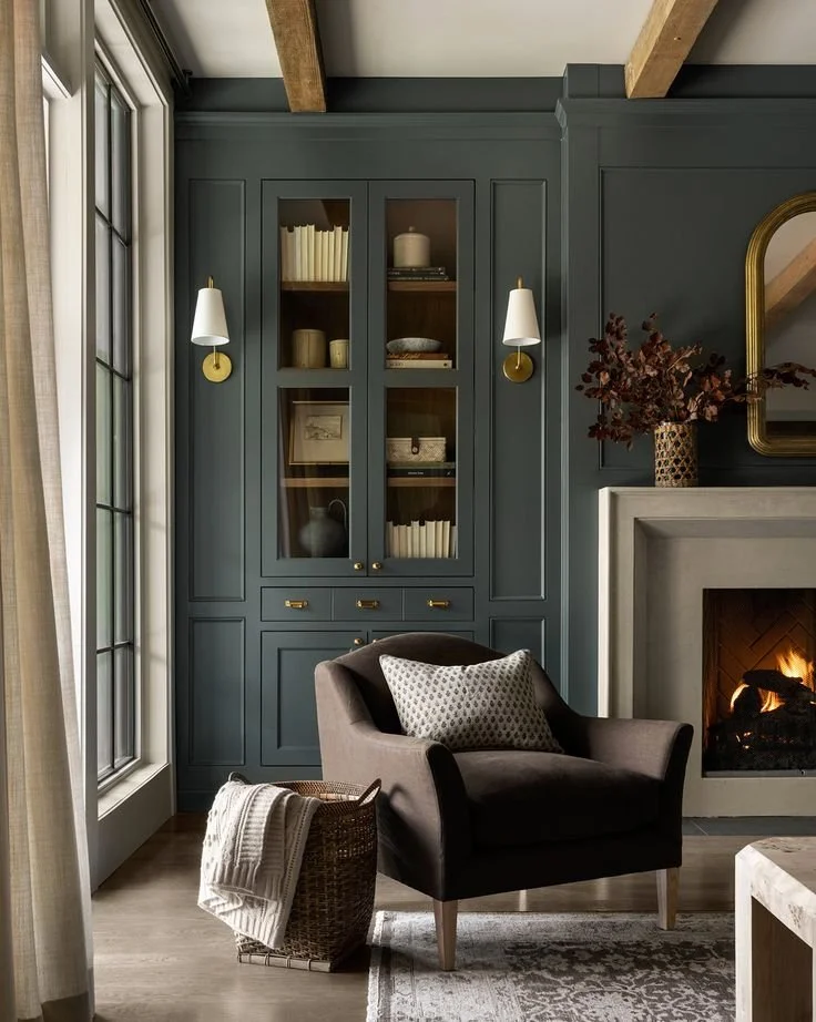
Color drenching is a maximalist design expression where one color is used on every surface in a room. It goes far beyond wall paint, creating a fully monochromatic appearance. This color concept extends to all of the following surfaces:

  • Walls

  • Flooring

  • Ceiling

  • Trim

  • Molding

  • Baseboards

  • Built-ins

  • Light fixtures

  • Window treatments

  • Furniture upholstery

  • Accessories

Keep in mind that variations in texture and tone are what make color drenching interesting, otherwise, it would feel monotonous!

Benefits of Color Drenching

Make a Space Feel Larger

One of the most exciting benefits of color drenching is that it can open up a small room. By using just one color (preferably a light hue) throughout the room, the boundaries of the walls become less defined, creating a seamless visual flow that tricks the eye into thinking the room is larger than it is. Color drenching also reduces the sense of visual clutter that multiple colors creates, making the space feel neat and tidy. For more tips on how to make a small room feel larger, click here.

Achieve a Cohesive Look

It’s no secret that color is one of the simplest and most powerful tools when you are designing a space. If you want a room to look well-designed without having to coordinate many different elements, try to choose variations on the same color and use them together in a room. By keeping it simple with your color palette, you eliminate the chance of clashing patterns or awkward transitions. 

Show Your Personality

Color drenching is about being bold with a capital B. If you want to share some of your personality through color, this is a great way to do it. Depending on your preference, you might use a deep jewel tone like emerald green, a more bright hot pink, or another of your favorite colors. Color drenching allows you to express your style as you create a wow-worthy space. 

Create a Serene Space

If you’re hoping to create a bedroom, bathroom, or office that feels as zen as a Japanese garden, try the color drenching trend with a light hue. For example, soft blues, pastels, and greys set the tone for a peaceful environment. The uniformity of color across the walls, furniture, and accessories eliminates visual distractions, allowing the mind to rest and focus. Check out this article for more inspiration on how to create a soothing bedroom.

It’s More Cost-Effective Than a Redesign

Finally, keep in mind that color drenching is a cost-effective alternative to a full redesign. Instead of replacing furniture or making structural changes, changing the paint colors, upholstery, and accessories in a space can provide a quick and beautiful refresh. We recommend choosing a color that already exists in your room, and amplifying it by incorporating other pieces in that hue. 

Color Drenching at Home

Ready to reach for your roller? Just remember that sometimes too much of a good thing can be, well, not-so-good, so it’s best to always have a plan of action with your design project. Whether you're aiming to transform your whole home with a unified color theme or just want to add a few colorful accents, we are always ready to assist! Reach out to us today to bring some color into your world.

Photo Credit: PAULA INTERIORS

PHOTO CREDIT: PAULA INTERIORS

PHOTO CREDIT: PAULA INTERIORS

PHOTO CREDIT: PAULA INTERIORS

PHOTO CREDIT: PAULA INTERIORS

PHOTO CREDIT: visual comfort

PHOTO CREDIT: PAULA INTERIORS

Back to School: 5 Ideas for Kids' Study Areas

School is back in session, which means many upcoming nights of homework for your kids. No matter what age they are, creating a designated study area at home can help boost their creativity and productivity. We are firm believers that their workspace shouldn’t be distracting, but it also shouldn’t be boring. To give you an idea of what we mean, we’ve rounded up some fun design ideas below, perfect for students in elementary or middle school. 

Choose an Engaging Wallpaper

Rather than blank walls, consider adding wallpaper with a funky print or pattern to their space. For example, you might create an accent wall with a map of the world. This idea is not only eye-catching, but it’s also inspiring to a future traveler. Or, you might opt for a bright botanical print, like this one, as a means of bringing nature inside. Select a wallpaper that reflects your child’s interests, or pick it out together. You want this space to feel as welcoming as possible as they will be spending a lot of time in it. 

Get Creative with Chalkboard Paint

Another exciting wall treatment for a kids’ school study space is chalkboard paint. While the chalk can be messy, this accent wall will encourage your kids to jot down their ideas, work out math problems, and doodle when they need a break. Plus, the ability to easily erase and start fresh means they can be as creative as they like without damaging anything. 

Promote Healthy Habits with a Sit/Stand Desk

If you have a child who doesn’t like to sit still, the answer might be that they shouldn’t be sitting at all. A lot of offices are turning to sit/stand desks for the ergonomic and health benefits for employees, but kids can also use these desks to improve concentration. A sit/stand desk is one that easily adjusts to any posture and lets your child be in control of how they work. It’s also better for them in the long run as it starts healthy habits and prevents them from slumping over a computer.

Set Up a Cozy Nook For Reading

To balance the standing desk, we recommend setting up a cozy reading nook. Choose a quiet place, whether a corner or a windowsill, and fill it with plush cushions, a soft bean bag chair, or a comfy armchair. Add warm lighting, such as a reading lamp or string lights, to enhance the magical atmosphere. Keep their favorite books within arm's reach by setting up shelves or baskets. 

Set Up a School Supply Ladder

Finally, to keep all their supplies organized, consider setting up a small ladder with open shelving. This vertical storage solution is perfect for holding notebooks, pens, art supplies, and even a few decorative elements to personalize the study space. Plus, it looks cute in a kids’ room!

Bonus: Your Dining Table Stays Clear

Of course you are designing a space to foster concentration and help your child succeed at school. However, creating an engaging space for them is also a gift for you as they won’t set up shop all around the house anymore. No more working at the dining table, kitchen counter, or floor of the living room. Designing a study space is an investment in your child’s wellbeing that benefits the whole family. Contact our Chicago interior design firm to get started on creating their mood-boosting homework space today.

Photo Credit: PAULA INTERIORS

PHOTO CREDIT: rubia m vieira interiors

PHOTO CREDIT: vanessafaivre

PHOTO CREDIT: west elm

PHOTO CREDIT: pinterest

Designing a Very Demure, Very Mindful Bedroom

If you haven’t heard of the latest viral Tiktok trend, let us explain. What began as a satirical video about ‘demure’ behavior has completely enchanted the fashion and design industry, influencing trends for the fall. While the term is already fading away from use in social media, the ‘demure’ concept is going strong with thoughtfully curated rooms that champion delicate hues, feminine details, and sophisticated vintage pieces. While we love maximalist, artistic rooms, there’s something to be said for finding moments of stillness with the following demure bedroom decorating ideas.

Restrained Color Palette

We’ve said it before, but one of the easiest ways to set the tone of a room is through color. A restrained color palette of neutrals and soft pastels immediately creates a more serene and mindful atmosphere than one with say, bold jewel tones.

In particular, blush, creams, and pale yellows are soaring in popularity as they bring a sense of ease to a space. You can start with the walls and work in, or simply make a few swaps for more muted hues at home. For example, adding soft cream-colored velvet pillows and a cozy knitted throw will instantly make your bedroom feel more demure for fall. Take a look at this nursery we designed recently for inspiration on how to create an elevated space with neutrals.

Floral Wallpaper

Part of the demure trend involves leaning into subtle feminine prints and details. Wallpaper is more popular than ever, and for this trend, we’re looking at understated botanical prints. Floral wallpaper in muted hues can serve as a stylish backdrop in a bedroom. When paired with minimalist, clean-lined furniture and cozy textures, the wallpaper will draw the eye without overwhelming the space.

French Mirrors

If you want to add an air of elegance to your home without changing much, try adding a French mirror. Look for one with an ornate silver or antiqued gold frame to elevate the muted color palette of your space with a touch of glamor. French mirrors not only serve as functional decor, they also make a space feel more open and inviting. Position yours above your vanity, dresser, or on a statement wall.

Scallops, Bows, Rattan, Oh My!

Elements like scallops, bows, and rattan further add to the whimsical charm of the demure trend. These elements can be added to bedding, curtains, or furniture to bring the smallest hint of playfulness to existing decor. While rattan is perfect for summer porches, it also adds an earthy, natural touch to the fall.

Quiet Luxury

Instead of embracing all things feminine and whimsical, you could interpret the demure design trend as being another arm of quiet luxury. Quiet luxury revolves around the philosophy of subdued designs and high-quality materials, creating an air of refinement without being flashy. Think clean lines and tailored detailing. For example, you might invest in a hand-woven rug, polished wood floors, or a vintage crystal lamp to master the art of quiet luxury.

Vintage Pieces

Adding vintage pieces into your home design is another means of embracing the demure trend. Vintage treasures carry a history and craftsmanship that modern mass-produced furniture often lacks. Plus, these one-of-a-kind gems come with a sense of nostalgia and authenticity that new items can't replicate. By shopping secondhand, you're also making a mindful and sustainable choice, which is very demure!


We always take new trends with a grain of salt, but the demure trend is one of the easiest to integrate into existing designs. At its core, it’s all about being mindful and understated, which is always a good way to begin if you’re not sure which design direction to take. Feel free to reach out if you’d like to experiment with this trend at home, and be sure to explore our other articles for more design inspiration!

Photo Credit: belarteSTUDIO

PHOTO CREDIT: Lulu and Georgia

PHOTO CREDIT: belarteSTUDIO

PHOTO CREDIT: Lulu and Georgia

PHOTO CREDIT: belarteSTUDIO

PHOTO CREDIT belarteSTUDIO

Chicago Interior Design Tips Inspired by the Windy City

The rich architectural heritage, historic music scene, and towering skyscrapers of Chicago make this Midwest gem truly one-of-a-kind. We are fortunate enough not only to live here, but to feel inspired by the culture and vibrancy in our interior design work. While our designs speak to the tastes of our individual clients, many have a local twist to them, honoring this great city. If we had to round up the main traits of Chicagoland, these are the quintessential style points we would emphasize.

Industrial 

Chicago's industrial style is widely recognized, reflecting the city's manufacturing history. Many of the old warehouses in the manufacturing districts have been transformed into residential lofts, shops, and restaurants. You won’t be hard-pressed to find brick walls, concrete floors, exposed beams, pipes, and floor-to-ceiling windows. To bring a bit of this industrial style into your home, consider incorporating sleek, industrial-style light fixtures, raw finishes, dark paint colors, and antique hardware. We love to blend luxurious and colorful elements with the industrial foundation of a home to create a cool, contemporary mix. See here for an example.  

Mid-Century Modern

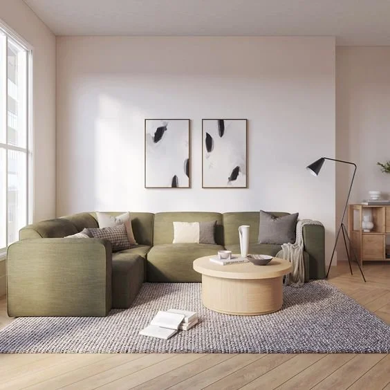
When it comes to architecture, Frank Lloyd Wright is synonymous with Chicago. The city hosts numerous buildings designed by this iconic mid-century modern architect, with Oak Park housing the world's largest collection of Wright-designed structures. As Chicago's interior styles are heavily influenced by its architecture, you’ll see plenty of Wright touches inside and out. To incorporate a bit of mid-century flair into your home, add geometric patterns, leather accents, earth tones, low-slung furniture, and bold graphic shapes to your space. Take a peek at this living room design for inspiration.

Speakeasy Style

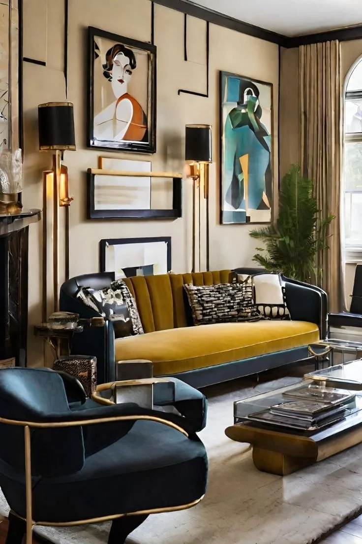
Chicago’s heyday occurred in the Roaring '20s, when speakeasies and jazz clubs were the heart of the social scene. Today, the city still boasts swanky nightlife spots and designs inspired by that period. Externally, Beaux Arts-style buildings are scattered throughout Chicago. Internally, you'll find luxe velvet upholstery, ambient lighting, brass finishes, jewel tones, and Art Deco accents. To infuse a touch of speakeasy flair into your own living room, consider adding some of these elements along with a bar cart stocked with your favorite cocktails.

Bright & Cozy

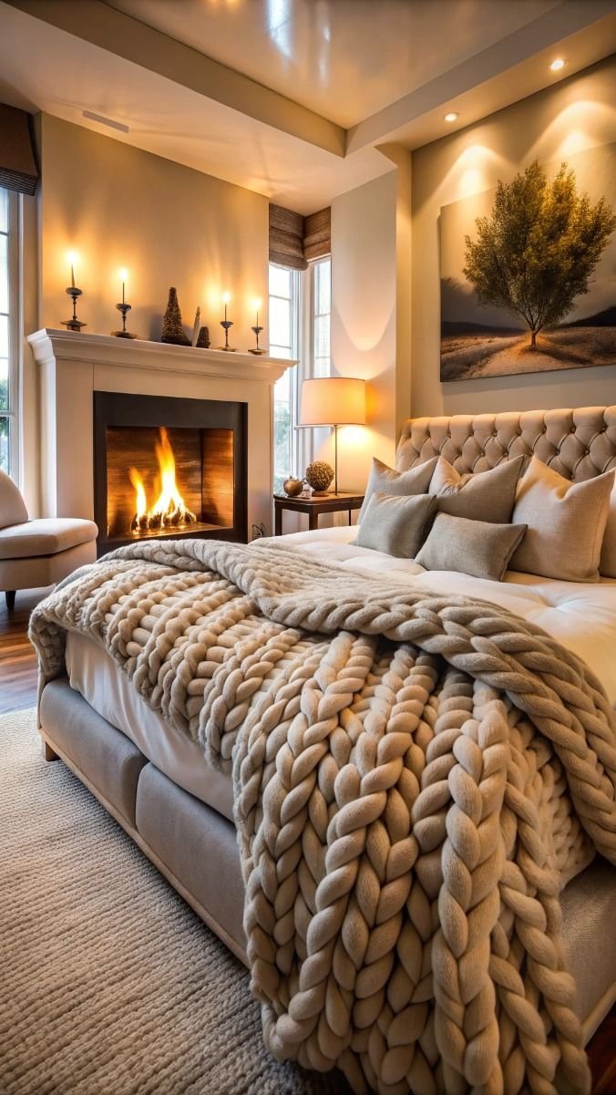
While there are countless reasons to love living in Chicago, the winters are not at the top of our list! Creating a warm and inviting ambiance during the long winter months is a must. We like to layer thick fabrics like wool and velvet with woven accents for both warmth and texture. On top of this, we use a lot of fun, vibrant colors to make any space feel brighter.

Artistic Flair

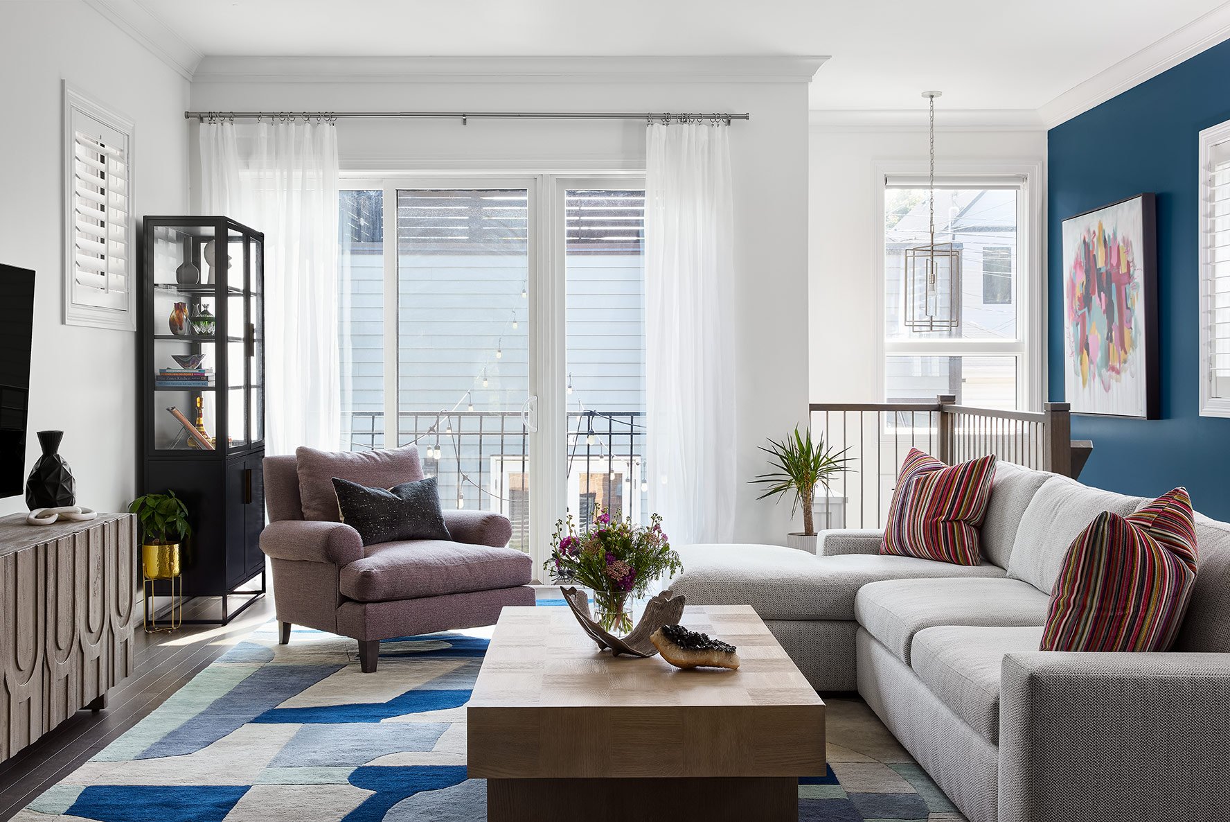
Finally, Chicago is known for its thriving art and music scene. We love to support local artists and artisans by incorporating their work in our designs, like in this recent project. Whether you have a work you've personally discovered and connected with or want us to curate a gallery wall featuring local art, these personal touches will infuse your home with character and charm.

Now that you've discovered the key design elements that make Chicago a style icon, let us assist you in integrating them into your home! From minor design adjustments to a full renovation, we're here to help you bring the flavor of Chicago into your living space.


Photo Credit: PAULA INTERIORS

PHOTO CREDIT:MY ELEGANT HOME

PHOTO CREDIT: MCGee y Co

PHOTO CREDIT: PAULA INTERIORS

PHOTO CREDIT: PAULA INTERIORS

PHOTO CREDIT: PAULA INTERIORS

5 Tips to Choosing Statement Lighting to Upgrade Your Home

Choosing statement light fixtures is like choosing artwork. It’s a highly personal experience that can bring joy to your space. Finding the perfect fixture in sea of sparkling chandeliers and pendants can be a bit overwhelming, but don’t let that discourage you! Once you find the right piece, it will illuminate your space in more ways than one. Here’s a quick guide to help you narrow down your options and find a fixture you love.

Find the Perfect Space 

The first step in the process is deciding where you need a statement light fixture. Do you want it to be above the dining table, in the center of a bedroom, or greeting guests in the foyer? Pinpointing the perfect spot will help you focus your search on fixtures specifically suited for that area. Be sure to think about the room's layout, ceiling height, and any existing furniture, as the fixture will need to not only fit in terms of scale, but also style. 

Create Layers of Light

To make the process of choosing a statement light less daunting, remember that this isn’t the only source of light in the room. A statement light should be functional, but it doesn’t have to do everything. By layering different forms of lighting, you can choose statement lighting that is more decorative than task-oriented. If you need stronger illumination for reading or cooking, install recessed lighting, sconces, and lamps in addition to your statement fixture.

Decide on a Design Direction

While lighting is one of most important parts of a room, it is often chosen last. In a way, this can be helpful as it gives you a design direction. For example, if you have minimalist interiors, you might decide on a bubble-shaped glass pendant light that melds with the serene surroundings. However, if you are designing a new construction property or doing a complete renovation, you should decide on a design direction before looking for your statement fixtures. If you need ideas for statement light fixtures, explore these Elle Decor picks.

Get the Size and Scale Right

Like any other design element, it’s important to pay attention to the size and scale of your light fixture. While statement lighting generally tends to be larger than other fixtures, it's important to avoid selecting a chandelier that's so oversized it detracts from the rest of the room. For example, in this dining room, the fixture is large, but the airiness of the cord frame makes it feel appropriate for the space. 

Experiment with Materials/Shape

Finally, treat your statement lighting as an opportunity to experiment. Explore the current trends, like woven rattan shades, colored glass, jewelry-inspired installation pieces, and mid-century modern designs. Thinking outside the box will create a more exciting focal point for your space. And remember, if you decide to shift your style in a few years, light fixtures can always be changed.

Lighting can be transformative to a home, particularly in a city with long, cold winters like Chicago. We’re happy to help in selecting the perfect statement light fixtures for your space, as well as advise on other design needs. Contact us today, and we'll help bring your interiors out of the darkness into a light, bright new future.

Photo Credit: PAULA INTERIORS

PHOTO CREDIT: PAULA INTERIORS

PHOTO CREDIT: pAULA INTERIORS

PHOTO CREDIT: URBAN OUTFITTERS

PHOTO CREDIT: BED BATH & BEYOND

8 Benefits of Benches for the Modern Dining Room

Need additional seating at a dining table or a sleek solution for your breakfast nook? Dining benches are on the rise. While traditional seating around the table is great, a bench opens up some additional possibilities while conserving space. If you’re working with a small room, or want flexible seating for the whole family, a dining table bench may just be the perfect solution!

Space-Saving

The compact nature of benches makes them a highly space-efficient choice for small areas. Dining chairs are less streamlined, with spatial requirements needed to move them around. When not in use, benches can be tucked beneath a dining room table, freeing up valuable floor space and creating a more open, uncluttered dining area. For smaller dining rooms or kitchen nooks, where every square inch counts, benches are the perfect non-bulky seating solution.

Accommodating 

In addition to being less obtrusive, benches can also seat more people! As they don’t have a defined seat for each person, you can squeeze an extra person or two in, which is ideal if you’re hosting family gatherings. This flexibility of having extra seats makes benches perfect for when you have unpredictable guest counts, ensuring that everyone has a place at the table without adding more chairs.

Less Clutter

In a busy kitchen or small dining room, you don’t want to constantly worry about knocking into a chair that has been pushed back. The streamlined silhouette of a dining or kitchen bench contributes to a clean, tidy aesthetic. Tucking your bench under the kitchen table makes the room feel more spacious and clutter-free, plus it eliminates trip hazards.

Unique Asymmetry

Another reason we love using dining room benches is that they go against the grain in terms of style. Even if your bench is a part of a dining set, it will still add a sense of asymmetry to a dining table. This lends a modern style to the overall design of the room. Take a look at how we used bench seating in this recent dining space to create unique, cozy seating.

Storage Space

There is another practical benefit to benches, especially in small spaces: they can include a storage compartment. While not all benches have storage, you can easily find ones that do. Storage benches provide a handy spot to put your table linens, rather than in your pantry.

Promotes Socializing

The final reason to love bench seating is simple: it’s more fun! Bench seating fosters a more social and connected dining experience, making it a dream for family meals or gatherings. Benches allow people to sit closer together, which encourages more interaction. Additionally, the shared seating setup of a bench can make it easier for everyone to engage in group activities, like playing games or enjoying a family-style meal. 


Offering a comfortable way to sit side-by-side, benches are stylish, streamlined, and easy. What’s not to love? If you're constantly worried about space and want a modern design with clean lines, we can't recommend bench seating enough. Give all of your family members a seat at the table with the perfect bench!

PHOTO CREDIT: PAULA INTERIORS

Photo Credit: BEHANCE

PHOTO CREDIT: pAULA INTERIORS

PHOTO CREDIT: CURATED HAVENS

PHOTO CREDIT: COZY CURATED

Common Items You Shouldn't Keep in the Bedroom According to Designers

Take it from us that what you keep out of the bedroom is almost as important as the design elements you choose to include. Creating a peaceful sleep environment means eliminating distractions and creating a tranquil space away from your daily routine. While it’s tempting to use your bedroom for work and exercise, these activities can easily disrupt the peace of your bedroom. Here’s how to turn your bedroom into a calming sanctuary.

Unnecessary Clutter

No matter what room you’re in, clutter should always be kept at a minimum. Particularly in a bedroom, unnecessary items create a sense of chaos, making it difficult to unwind. Rummaging through a junk drawer makes it hard to find what you need, adding to your daily stress before you've even left the house. Instead, keep the bedroom clutter at bay with built-in shelving and concealed storage that holds only essential items. You don't need a professional organizer to get a better night’s sleep or have more mental clarity during the day.

Work-Related Items

A lot of people living in small spaces like an apartment keep a desk in their room, but it’s not a great practice. Putting your office space in the bedroom blurs the lines between work and rest, which reduces the efficiency of both activities. In addition to a desk, try to avoid bringing laptops, important documents, and other work materials into your bedroom. Instead, carve out a small home office in the kitchen, living room, or any other separate room. You can even consider a wall-mounted desk in a hallway that can be folded up when not in use.

Electronics

In the same vein, try to avoid bringing electronics into the bedroom. A lot of people have TVs in their bedrooms, but these can negatively impact your sleep. Instead of going to bed, you’ll be tempted to watch a show…then another and another. The blue light can keep you awake for hours. Plus, TVs can be an eyesore that distracts from the beauty of a room’s design. If you are dead set on including a TV, consider these discreet positioning ideas. 

If you struggle with poor sleep, it is also recommended to leave your cell phone, iPad, and other electronic devices outside the bedroom as these can affect your sleep cycle. Rather than a phone, try putting an old-fashioned alarm clock on your bedside table to help you wake up without the negative energy that blue light, text messages, and emails bring.

Exercise Equipment

If you exercise at home, keep your equipment anywhere except your room. Not only is gym equipment often clunky and unattractive, but sweating in the place you sleep affects the overall mood of the room. It’s best to put your dumbbells, yoga mat and Pelaton in a garage, spare room, or home office.

Food and Drinks

At the end of a long day, it can be tempting to bring food items and drinks (other than water) into the bedroom. However, this is never a good idea. First, it can lead to a range of issues that disrupt the cleanliness of the space. Crumbs and spills can attract pests and create difficult-to-clean stains, while lingering odors may detract from the room's relaxing atmosphere.

An Uncomfortable Bed

From the bedframe to the mattress to the linens, it’s worth it to invest in your bed. An uncomfortable bed can dramatically affect your ability to get a good night's sleep. Additionally, a mattress that is too firm or too soft can result in achy joints or back pain. Restful sleep equates to more enjoyable, healthy, and productive waking hours, so make it a top priority.

Harsh Overhead Lighting

Bright, glaring lights can create a harsh atmosphere in your room, making it difficult to relax. They can also cause eye strain and headaches, especially when turned on first thing in the morning. Instead of an overhead light, layer adjustable, warmer lighting options such as a dimmable table lamp, floor lamp, and wall sconces to create a cozy sleep space.

Remember, more than any room in the house, your bedroom is your sanctuary. Keep this valuable space free of clutter, such as junk, dirty clothes, and gym equipment. To foster a healthy work/life balance, consider setting up your desk in a different room, ensuring your bedroom remains as sleeping quarters. After the decluttering process of a messy bedroom, you'll feel more at ease and ready to get a great night's sleep. 

PHOTO CREDIT: PAULA INTERIORS

Photo Credit: PAULA INTERIORS

PHOTO CREDIT: pAULA INTERIORS

PHOTO CREDIT: PAULA INTERIORS

Design Tips for the Ultimate Family-Friendly Living Room

The living room is the central hub of any home, a communal space for the entire family to gather. For families with young children, this do-it-all room has to cater to their specific needs while also providing a beautiful and comfortable space for adults. Every family is different, and a family-friendly home should reflect favorite activities as well as a sense of their style. 

As a leading interior design firm in Chicago, we delight in creating spaces that the entire family can share together. Here are some of the most important considerations to keep in mind when designing a family-friendly living room.

Create an Open Layout

We recommend an open-plan or broken-plan layout for a family-friendly living space. In an open plan, both the living area and dining room are included in one space. A broken-plan layout works the same way, except that sliding doors can close the open area, making it possible to use the rooms independently. These layouts make it much easier to keep an eye on young kids while they play, while still providing plenty of room to relax. 

Opt for Built-in Storage

Having safe storage solutions in your living room is the only way to keep it tidy. Built-in shelving is an ideal solution in a busy family home. On the lower levels, you can keep all of your kids' toys within their reach in large baskets, while the upper shelves can be dedicated to your books, family photos, and decorative items. You want to prevent little kids from knocking things over or injuring themselves while reaching for their toys or board games.

Choose Kid-Friendly Modular Furniture

When it comes to kid-friendly living room furniture, we suggest opting for modular designs, such as a large sectional sofa. A round coffee table and side tables with curved edges are also a great call, like the ones we chose for this recent design project. Sharp edges are a definite no for homes with small children. A sofa bed is ideal for quick naps for the little ones, or it can be used by the older kids for sleepovers. Of course, it can also be used for overnight guests during family gatherings. Additionally, furniture with built-in storage, like storage ottomans or benches, can help keep your living room organized and clutter-free.

Choose Performance Area Rugs 

Washable rugs made from performance fabrics are a great option when designing your family room. Many popular brands like Ruggable sell soft rugs that are perfect for cushioning those inevitable falls your little one will have. Additionally, using non-slip rugs and matting can prevent slips and trips, adding an extra layer of safety without sacrificing style.

Opt for Overhead Lighting

Installing recessed and hanging lighting is the best way to minimize the risk of accidents in a family room. You can still make a fun choice, like this sputnik pendant light. If you do opt for a lamp, make sure all the cords are securely tucked away to avoid tripping. We’d also recommend that you steer clear of spindly lamps that can easily be knocked over by little ones. Finally, be sure to use socket covers throughout the room to keep tiny fingers safe from electrical outlets.

Hang a Family Photo Gallery Wall 

Creating a family photo gallery wall is a wonderful way to personalize your living room. Mix in photos of family members with your children's artwork to add a unique and sentimental touch. This not only showcases your family's memories, but also makes the space feel warm and inviting. Rotate the artwork regularly to keep the display fresh and celebrate your kids' creativity.

At the end of the day, your living room should feel like a stylish and functional space that promotes quality family time. It should adapt to your growing family, with a functional layout and plenty of storage. No matter what your design style is, we always prioritize our clients’ wishes, making them feel at home in a living room that suits the needs of the whole family. Contact us today to set up a consultation to start creating your dream living room design!


Photo credit: PAULA INTERIOS

PHOTO CREDIT: PAULA INTERIORS

Photo Credit: ARTICLE

PHOTO CREDIT: pAULA INTERIORS

PHOTO CREDIT: PAULA INTERIORS

PHOTO CREDIT: ETSY

How to Transition a Nursery into a Big Kid Room

As your little one transitions from baby to toddler to big kid, their room may need a few small updates to make them feel at home. Children grow so quickly that you don’t have time to redecorate at every stage, but you can make simple swaps that will help create a big kid bedroom that grows with them. Here are some small ways to turn a child's nursery into a toddler-friendly space. 

Make Important Furniture Swaps

Start by making a few essential furniture swaps in their current nursery, replacing baby furniture with items fit for a child's room. Remove the changing table and crib to make space for their new bed and new dresser. You can choose between a toddler bed, a toddler rail kit, a twin-size bed, or bunk beds depending on your child's needs and the floor area available. Keep in mind that a horizontal dresser is preferable to a vertical one because it allows your child to easily reach their clothes.

Design the Layout

When designing the layout of a big-kid room, we suggest placing the bed in a corner to free up more floor space for a small play area. Additionally, you can create a cozy reading nook with a small bookshelf to support your imaginative kid. By thoughtfully arranging the room, you can make it both a beautiful and safe place for your growing child.

Choose a Playful Wallpaper Together

Selecting a fun wallpaper together is a fun and engaging way to involve your child in their room transformation. If you anticipate changing the wallpaper in a few years, try removable peel and stick wallpaper. Rather than selecting specific characters that your little one will quickly outgrow, incorporate their favorite color and a general style that reflects their personality. Adding personalized touches in the rest of the room such as name plaques can also make the new room feel uniquely theirs.

Books and Toy Storage

As they grow, young children will begin to appreciate their growing collection of toys and books. To keep everything organized in their play space, invest in solid storage solutions. In a nursery, these can be mounted to the wall, like in this recent project. However, for little kids, you should aim to install shelving units with easy access to their favorite items. We also recommend buying a few baskets to store small toys and books. These storage options not only help maintain tidiness but also encourage your child to help in cleaning up.

Add a Crafts Table/Reading Desk

Finally, adding a small crafts table or reading desk is always a good idea. This addition will serve as a creative space for arts and crafts and can easily transition into a homework desk as your child grows older. Providing a dedicated area for in-room activities will help create a more productive and focused environment.

To create a smooth transition, we encourage including your child in the design decision-making. We always try to get even our smallest clients involved with the selection of furniture and color scheme, incorporating their favorite things. It is their room, after all! This collaborative approach to design not only makes the simple changes more exciting for your child, but also fosters a sense of pride in their personalized, new space. 

PHOTO CREDIT: pAULA INTERIORS

PHOTO CREDIT: AMAZON

Photo credit: Pinterest

PHOTO CREDIT: pAULA INTERIORS

Photo Credit: pINTEREST

A Guide to Selecting Geometric Shapes for Your Space

When outlining an interior design, the shapes you choose to fill each space are fundamental to the sense of balance and flow. As a leading Chicago interior design firm, we’re familiar with using the entire spectrum of geometric shapes, from gentle curves to more boxy mid-century modern forms. At the heart of every design is geometry, so even if your design includes organic forms or bold patterns, they often stem from fundamental geometric principles. 

In this guide, we'll explore the significance of specific shapes and how various geometric elements can influence an interior space.

Circles

If you’re hoping to create serene living spaces without harsh edges, incorporating circular shapes is a must. Circular furniture like round tables and sofas not only look more inviting, but they take up less space than square or rectangular forms. For example, if you only have a small corner for a dining table, we recommend a circular table as it will allow more people to gather in a smaller area.

Squares

Squares are another popular choice for both large and smaller spaces. You’ll find them across tile patterns, furniture, and decor accessories. The sharp edges and right angles of this classically symmetrical shape lend a sense of order and stability to your surroundings. For example, a checkerboard pattern uses repeating squares to bring a sense of movement and energy to rugs, wallpaper, and upholstery.

Rectangles

With straight lines and sharp angles, rectangles are the most commonly seen shape in furniture design, windows, and flooring. They mimic the shape of most rooms, providing a traditional look that feels orderly. As a result, you'll often find rectangular furniture and home décor in functional spaces like the kitchen and home office. 

Stripes

Stripes can change the perception of space, making a room seem either larger or more intimate depending on their orientation. We love using straight lines in wallpapers, fabrics, rugs, and more to introduce visual interest and direction into a space. Take a look at how we used sleek lines in this nursery to bring a modern twist to a classic stripe pattern.

Triangles

The triangular shape represents balance, providing a sense of harmony to any space. In fact, many designers follow the 'Triangle Principle,' which involves the careful placement of items to create a triangle shape. This principle helps focus attention toward the center of the triangle to highlight items like wall decor, a sofa, or a bathtub. Equilateral triangles can also be incorporated into art, textiles, upholstery, and light fixtures.

Herringbone Pattern

Many popular patterns blend interesting shapes, but one of our favorites is the subtle geometric pattern of herringbone. This pattern introduces a sophisticated texture and movement to interiors. Often used in flooring, backsplashes, and upholstery, herringbone adds a touch of elegance and an old-world feel.

Remember thinking you had left geometry behind in school? Not so! While the use of geometry is crucial in interior design, think of it as a fun and practical real-world application. By focusing on the science of shapes, you can create a modern, cohesive interior design that feels elevated. Using the existing architectural elements of your home combined with the purpose of the room and overall design aesthetic, you can create a space that has the right balance of style and functionality.

Our interior designers love taking geometric forms and making a bold focal point in a dining room, bedroom, or living room. For more inspiration on how to create a geometric design, view our latest design projects here!


PHOTO CREDIT: pINTEREST

PHOTO CREDIT: PINTEREST

PHOTO CREDIT: EIJERKAMP.NL

Photo credit: PAULA INTERIORS

Photo Credit: pINTEREST

The New Wave of Wallpaper: Beautiful Designs for 2024

Wallpaper has had a huge comeback and a stylish rebrand over the past decade. Whereas a traditional wallpaper design was associated with the peeling rooms of a grandmother’s house, the different colors, patterns, and textures of contemporary wallpaper designs provide a modern feel. 

Wallpaper may be slightly harder to apply than paint, but it adds incredible depth and visual interest to a living space. With today's options of wall coverings, you can inject a subtle pop of color, create an optical illusion with geometric prints, or enjoy the look of a whimsical mural around your dining table. 

Here are some of our favorite trends from the wonderful world of wallpaper.

Flora & Fauna

Gone are the stuffy, pale florals of yesteryear. The newest prints feature everything from bright, lifelike botanicals to painterly petals that make your walls look handcrafted. From William Morris floral wallpaper to tropical banana leaf wallpaper, you can create a beautiful backdrop inspired by nature. 

We also love the animal-printed wallpapers that have recently become available. A crouching tiger print in a powder room or a series of safari animals for a nursery can create truly magical scenes.

Textured Wallpapers

One of the biggest innovations in wallpaper over the past decade is the introduction of textures. You now have the option to adorn your walls with a natural material like woven grasscloth or luxuriously soft velvet. The range of faux finishes includes everything from marble and brick to natural wood. In a smaller space, these will add extra dimension and the illusion of more space.

Stripes

While classic stripes have always been around, they've recently become a popular wallpaper choice. Today's stripes are often bolder and feature bright pastel colors, adding a bit of fun to any space. Take a look at this recent project we completed to get a sense of how to incorporate stripes of different sizes.

Metallics

In the right room, metallic wallpaper can create a bold and exciting statement. Wallpapers with a subtle glitter or iridescent sheen add a touch of sparkle without being overly dramatic. This is a fun way to add dimension to a small space like a bathroom. 

Geometric Prints

As a means of adding visual interest across an entire space, we’ve used lots of bold, large-scale geometric patterns in recent years. This includes abstract shapes and clean lines that create eye-catching tesselations, like in this recent dining room project. You can achieve a retro look or a modern look with the bold pattern of a geometric wallpaper.

Wallpapered Ceiling

Instead of a traditional pattern or color, this clever use of wallpaper involves applying it to an unexpected place: the ceiling. Make the ceiling the feature wall, or cover all five walls in the same wallpaper to create an immersive space. 

Additionally, there's a growing trend of matching wallpaper prints with draperies and furniture upholstery. While it may sound intense, this approach can create a cozy and striking space, provided other elements remain neutral.

Murals

As a more cost-effective mural, you can opt for a large-scale mural wallpaper featuring a landscape scene. A panoramic wallpaper can create a space that feels immersive and bespoke. There is even the option for hand-painted wallpaper, which offers a similar effect to if the artist had painted directly on the wall. This is an excellent choice for a dining room or sitting room where you're willing to invest a bit more to create a memorable space for entertaining guests.

We hope these ideas have inspired you to consider incorporating wallpaper into your home! Whether for a master bedroom or a small bathroom, the right wallpaper can inject personality into your interior design. While you might not use wallpaper in every room, you can make a bold design statement or create a focal point with striking wallpaper. For more creative ways to use wallpaper, be sure to explore our project portfolio.

PHOTO CREDIT: paula interiors

PHOTO CREDIT: is that soh

photo credit: pinterest

Photo credit: Mitchell black home decor

Photo Credit: paula interiors

Design Strategies To Make Your Living Room TV Look Good

We all love our TVs, but let’s face it, they are an eyesore. When you step into a living room, you don't want the TV to be the first thing that catches your eye. Instead, it should be made to blend in, hide, or complement existing decor. 

Whether you're a film buff with a screen that rivals a movie theatre or only watch your favorite shows once a week, there are plenty of creative design strategies to style your TV in your family room. From clever framing options to strategic color choices, our Chicago interior designers are well-versed in styling TVs so that they actually look good. Here are a few of our recommendations for strategic TV placement.

Camouflage Your TV 

Surround it with Built-in Shelves

One of the most popular strategies is to place a TV in between open shelves. Surrounding your TV with books, decorative pieces, and picture frames makes it less noticeable as an eyesore. Instead, the eye focuses on the items around the TV, only paying attention to the screen when it is turned on.

Paint the Walls Dark

The problem with a big black screen is that the color doesn't blend with most walls. Particularly if you have light-neutral or white walls, the dark color of your TV will inevitably stand out. A clever way to combat this is to opt for dark walls in modern living rooms. This will create a striking and sophisticated backdrop, making your TV blend in while elevating the overall ambiance of the room. Dark hues like charcoal, navy, or hunter green lend a sense of drama and intimacy, making the room feel cozy and inviting in a way that offsets the cold appearance of a TV. 

Place Your TV Above a Fireplace

Positioning your TV above a horizontal electric fireplace is another way to distract from it. As the fireplace is a focal point of your living room, placing the TV above it will instantly boost its appearance. This arrangement not only optimizes space but also creates a cozy atmosphere, as the fireplace emits warmth and ambient lighting. See how we used this tactic in a recent living room design project. 

Hide Your TV

Within an Entertainment Center

Imagine a media room where your TV vanishes when not in use! That's the magic of concealing your screen within a custom-built media console. By tucking the television away in a media unit, our Chicago designers create a space that maintains its aesthetic appeal while still offering all the functionalities of a modern entertainment hub. A well-designed TV unit can be a statement piece in itself, with doors that blend seamlessly with the room's decor when closed. Whether you choose to have a classic wooden cabinet or a sleek minimalist look - when the screen is out of sight, the media center becomes an elegant addition to your living space.

Behind Artwork

Hiding your television behind a large piece of art is not just a clever design move; it's a conversation starter. You can create a feature wall where all you have to do is press a button and your canvas will slide away to reveal your screen. Whether the artwork is a bold abstract piece or a serene landscape, let it serve as both a focal point and a disguise!

Elevate Your TV

Float Your TV

Elevate your viewing experience by giving your television the illusion of floating. By emphasizing clean lines, this modern approach to mounting brings a sense of lightness and sophistication to your living room. To achieve this effect, our Chicago designers will carefully install a TV mount that allows a large TV to hover just off the wall, with no visible TV stand or clunky hardware. Floating your TV saves valuable wall and floor space, while also making the TV as sleek as possible. 

Recess Your TV

If you have the design capability, recessing a flat screen TV at eye level is another clever design strategy to give it a more bespoke feel. This design strategy frames your screen within the architecture, elevating it with an artwork-level mounting treatment.

Mount Your TV On Wood Panelled Walls

Finally, consider mounting your TV on wood-paneled walls to create a striking feature wall. Our interior designers often use rich woods to balance the modernity of a screen. Additionally, wood paneling lends a touch of craftsmanship to the setting. Whether you choose sumptuous dark woods for a stately ambiance or light, airy woods for a Scandinavian touch, the panels will bring a sense of serenity and connection to nature.

Use a Projector

If none of these ideas strike your fancy, you can always switch to a projector! Project your favorite movies on the wall, or install a pull-down screen on the wall or ceiling for easy viewing. This is a great option for TV buffs limited to a small space.

Our Chicago interior designers understand that every detail matters, including the appearance of your TV. When you’re designing a beautiful space, there’s nothing worse than having one eyesore to mess up the visual impact. It’s why you never see TVs in design magazines. Get in touch with a Chicago interior designer from our team today -- we'd be happy to help create a stylish space with a TV that functions for movie nights without stealing the show.

PHOTO CREDIT: quiet joy at home

PHOTO CREDIT: Salman’s decor

photo credit: abbotts at home

Photo Credit: pinterest

Photo Credit: etsy

photo credit: home designing

7 Interior Design Rules You're Allowed To Break

In today’s field of interior design, breaking the rules is not just accepted—it's celebrated! While following conventional wisdom is helpful for beginners, there are truly no hard and fast rules when designing your home. At our Chicago interior design firm, we make each decision based on what appeals to your personal style. 

Here's a look at some traditional design principles and why disregarding them can lead to exciting results.

Art Should Only Be Hung on the Wall 

Art is a soulful expression that does not need to be bound by walls. We love to display art in unconventional ways — from sculpture on the coffee table, to canvases casually leaning against a mantle. Experimenting with the placement of a piece of art invites a dynamic and eclectic energy into your space. Art doesn't have to be at eye level -- you can create visual interest by placing it higher or lower, encouraging new perspectives and interactions.

Formal Spaces Should Be Formal 

A formal living room or dining room doesn't have to feel stuffy or untouchable. In recent years, the priority has shifted away from formal dining rooms toward more multifunctional spaces. Instead of worrying about matching furniture sets and perfect symmetry, don't be afraid to mix up your decor to better meet the needs of your everyday life. Soften your formal spaces with plush seating, artwork, ambient light fixtures, and cozy textiles to invite people in and encourage them to linger.

Avoid Pattern Clashing

A fearless mix of patterns, light colors, and dark colors can yield thrilling results. The trick is to unify different patterns through color, scale, or theme. For example, try pairing floral pillows with a geometric rug if they share a color scheme. You’ll know if the clash is good or bad – trust your instincts and don’t be afraid to experiment.

Don’t Mix Metals 

Who says you can’t mix silver and gold? Just like with jewelry, mixing metals in your living space instantly adds depth and character. Copper hardware, a brushed steel side table, and a golden mirror frame can coexist beautifully. The key is balance—choose one metal to serve as the dominant hue while others act as accent pieces. Combining different materials is one of the easiest ways to achieve a unique look that feels personal.

Stick to One Design Style 

Gone are the days of strict adherence to a single design genre. Mixing different design trends and different eras results in an eclectic mix of design elements that makes a home feel more authentic and lived-in. For example, juxtaposing sleek modern furniture with traditional Persian area rugs creates a rich, layered look that tells a story. Remember, the most obvious choice of decor isn't always the best!

Wood Finishes Should Match 

Different wood tones can live in harmony and make a space feel more homey. The secret lies in choosing a complementary color temperature (warm or cool) for the various wood finishes and allowing grain patterns to play off each other. For example, a mahogany dining room table can meld beautifully with medium wood floors. Or, as in a recent project we completed, you can place a quirky medium-toned wood chair on dark wood floors. Contrast is key. By mixing different wood finishes, your space will naturally come across as more warm and layered.

Ceilings Must Be White 

Don’t forget about the 'fifth wall'—the ceiling. Rather than white ceilings, try a rich hue, install decorative tiles, or opt for a wallpaper that draws the eye upward. By decorating the ceiling, you’ll create a cocoon-like environment where every square inch in your room feels special.When it comes to interior design, rule breakers are the true visionaries. Venturing beyond the traditional boundaries of interior design rules is the best way to turn houses into homes. By creating a space that truly resonates with your personal style, you’ll not only invite a sense of innovation but also make room for joy. If you’re considering starting a design project at home, reach out to our team of Chicago interior designers today – we’re always here to help. 

PHOTO CREDIT: soho home

PHOTO CREDIT: paula interiors

photo credit: burke decor

Photo Credit: gramy deco

Transform Your Home into a Springtime Splendor with These Decor Ideas!

Now is the perfect time to give your home a quick springtime styling. Design around vibrant colors and florals, these styling ideas will instantly brighten up your home and make it feel fresh and welcoming.

From embracing natural materials to introducing light and airy pastel hues, let’s explore how to create a springtime atmosphere.

Fresh Flowers

Nothing embodies the spirit of spring like fresh flowers and greenery. Create bouquets around the house using seasonal blooms, such as fresh tulips, peace lilies, and cherry blossoms. These delicate florals will add lots of color and a bright scent while serving as a reminder that warmer weather has arrived.

Spring Wreaths

Welcome guests into your home with a beautiful spring wreath on your front door. As your wreath is the first thing your guests will see when they arrive, it should make a statement! There are so many fun Easter wreath ideas, from using faux flowers to fresh eucalyptus. You can even hang decorative Easter eggs from colorful ribbons to create a custom egg wreath that can be seen from the street.

Soft Pastel Furnishings 

If you haven't already, replace thick winter blankets and bed linens with lighter alternatives in soft spring colors. To celebrate this new season, you might consider investing in some throw pillows or upholstery that incorporate spring flowers or other symbols of spring. When choosing fabrics, opt for lightweight, natural materials like cotton and linen that will be comfortable through the warmer months. 

Fresh Spring Scent

To add to the sensory experience of the spring season, choose a signature scent for your home. Candles or diffusers with fragrances like fresh linen, floral scents, or zesty grapefruit will create a welcoming atmosphere for family and friends the moment they step into the home.

The best part about these spring decor ideas is that you can enjoy them into the summer! The light colors, fresh florals, and springtime accents can be kept up for far longer. Let your creativity shine as you bring the beauty of spring into every corner of your home. 

Happy Spring, everyone!

PHOTO CREDIT: etsy

PHOTO CREDIT: quiet joy at home

photo credit: pinterest

The Ultimate Planning Guide for Your Home Renovation

Whether a single room or an entire house, starting a home renovation project is a big undertaking. From budgeting to working with numerous companies, there are a lot of moving parts that require attention in order to bring your vision to life. 

As one of the leading interior design firms in Chicago, we’ve worked on countless renovations as well as new construction projects. If you’re thinking of renovating your home, but don’t know where to begin, take a look at this quick list of questions that you should ask before diving into a new project.  

What Needs an Update?

Before doing anything else, make a list of your overall goals and the scope of work that needs to be done. Renovations can take a long time, particularly if you have an older home that needs structural work. Break your project into needs and wants and prioritize what has to be done before adding in the bells and whistles. 

What Is My Renovation Budget?

Home renovation costs can range dramatically, so it's important to outline a realistic budget before having any work done. Quality is key, and investing in high-grade materials and skilled craftsmanship pays off in the long run. Be sure to consult with your real estate agent to understand how the renovation might impact your home's value. However, don’t forget to include a contingency fund for unforeseen expenses. 

Who Should I Hire?

Selecting the right contractor, interior designer, and architect is important in bringing your dream home to fruition. Look for professionals with a portfolio that resonates with your style. Whoever you choose should have a reputation for quality workmanship and reliability. When in doubt, ask friends and family members for their recommendations and always read reviews!

Have I Checked All Regulatory Requirements?

To experience a successful renovation, you need to pay attention to all local regulations. Depending on the scope of the home remodel, you may need a detailed plan and building permit to be approved by your HOA. For example, if you want to add solar panels, or do major renovations to the exterior of your home, you'll likely need to get approval before starting your remodeling project.

Does This Contribute to the Design of My Home?

Your design should blend both style and practicality. Your home reflects who you are, so choose items that complement the overall design. Not every room has to coordinate, but we recommend creating a flow so that the home feels cohesive overall. 

How Much Time Do I Have?

No matter what size home improvement project you are doing, be sure to set a timeline. Almost certainly, you can factor in unexpected delays, as there are a lot of unknowns no matter what the scope of your project is or who you are working with. Develop contingency plans should building work or furniture be delayed. 

If you're in the planning phase of your renovation project, you've come to the right place! Our Chicago interior designers can create a full renovation plan for you, guiding the process from start to finish. Renovating your home is not just about updating its look; it’s about enhancing your lifestyle and hopefully, increasing the value of your home. With careful planning, a clear vision, and the right team, you can bring your vision to life. Contact us today to get started on a home refresh.

PHOTO CREDIT: design milk

PHOTO CREDIT: pinterest

PHOTO CREDIT: emily henderson

photo credit: elle decor

Adorable Gender-Neutral Nursery Ideas for Baby

There’s nothing more fun than designing a nursery! We love thinking outside the box to create rooms where little ones can relax, play, and grow – a space that expresses joy and fun. To create a nursery that is welcoming and adaptable for any child, we have a few tips that we’re happy to share with expectant parents. Let's dive into some practical ways to create a gender-neutral nursery that fosters inclusivity and versatility.

Opt For Neutral Colors

Let’s start with the most simple element– the color scheme. The easiest option is to go for neutral tones. Timeless and serene, cool grays, fresh whites, and inviting beiges are an easy foundation for any room. You can start with white walls and add nursery furniture in earthy tones that create a warm welcome. These neutral hues provide a soothing backdrop that will allow you to decorate with various themes and accessories. Take a peek at one of our recent neutral nursery design projects in Roscoe Village, Chicago, where we used shades of cream and gray to create a sophisticated and beautiful space.

Or, Try Another Unexpected Color

Foregoing colors like pink and blue that are linked to gender, you can still choose a colorful hue for your little one’s nursery. For example, pastel yellow and soothing sage are beautiful paint colors for your baby’s haven. Just be sure to choose a color palette that will give you peace of mind -- stay away from brighter colors like red and orange.

Neutral Nursery Themes

When it comes to choosing a gender-neutral nursery theme, there are so many options. Here are some interior designer favorites that would be perfect for a neutral baby room.

  • Inspired by a Children's Book: Bring to life a childhood classic like Winnie the Pooh, Paddington Bear, or Peter Rabbit. By basing your baby's room design on a book, you can inspire their imagination and create a truly lovable, gender-neutral space.

  • Hot Air Balloons: Let your baby's imagination soar with hot air balloons in primary colors. 

  • Starry Sky: Create a celestial-themed room with decor reflecting the stars, sun, and moon. 

  • Animals: Is there anything cuter than baby animal prints? Fill your baby’s room with adorable farm animals, woodland animals, or safari animals that will make them smile. 

  • Geometric Patterns: Create a sophisticated nursery with geometric patterns. A chevron print or stripes create a bold and beautiful design for your nursery that stands the test of time.

  • Nature-Inspired: Opt for nature-inspired nursery decorations with motifs revolving around the forest, the beach, or mountain peaks. Decorate with natural materials that further emphasize the organic theme. 

  • Vintage Maps: The world is their oyster, and this fun theme will foster a love of travel from an early age.

Go Big on Texture

If you’re choosing to go with a neutral wall color, like cream or gray, be sure to incorporate fun textures that will enhance the atmosphere in the room. Soft faux fur rugs, knit pillows, and a fuzzy rocking chair will make the room feel welcoming. 

Add Personalized Touches

No matter what your baby's gender is, you can create a unique space that feels custom. Personalized artwork or decals, a monogrammed crib sheet, and other baby essentials will make the space feel special for them. Personal touches not only add sentimental value but create a strong connection to the space.

As a leading Chicago interior design firm, we’re experts in bringing to life spaces that you will enjoy spending time in. We believe a nursery is more than a design choice, it’s a commitment to providing a nurturing environment for your little one to grow. Celebrating the uniqueness of every child, we design gender-neutral nurseries that both you and your baby will love. Get in touch to schedule a design consultation today and we'll help you bring to life the perfect nursery.

PHOTO CREDIT: paula interiors

PHOTO CREDIT: pinterest

photo credit: Paula interiors

photo credit: paula interiors

4 Common Renovation Mistakes & how to avoid them

PHOTO CREDIT: PAULA INTERIORS

The process of planning a home renovation can be very stressful. There are several potential problems along the road, beginning with the selection of the project and continuing all the way through the finishing touches.

Preparation is key when demolishing walls to extend the bathroom or constructing an open-concept main floor. Here's how you can avoid the most typical renovation mistakes.

1.      Have a Clear Vision

Before researching contractors and remodelers, have a vision on how you want the space to feel or look. Changing a project's design might be more complicated. Detailing your vision will also help your contractor or designer. More decisions upfront will lead to more accurate estimates.

2.      Do Not Rush Through Things

PHOTO CREDIT: PAULA INTERIORS

PHOTO CREDIT: PAULA INTERIORS

Remodeling your master suite or any other part of the house is exciting, but you'll regret rushing later in the process, which is why it is crucial that you take your time.  Your home improvement won't happen overnight. The design process requires exact measurements and consideration of space functionality. Avoid diving right in to ensure everything is done correctly.

3.      Do Not Hire in Urgency

Yes, that is right. People tend to hire the first contractor that they come across once they quote a price. As per the industrial experts, the price is not the only thing that one should look for while hiring a home renovator, architect, or designer. There are many other things that one should consider, such as the quality of workmanship and the report you have with them. Simply hiring based on the price quote without further evaluation will only result in later regrets.

4.      Stop Being an Idealist

Well, it is true. People at times get idealist when deciding on a budget while completely forgetting the ground realities. Therefore, it is important to set realistic figures instead of lowballing, as it will only decrease the work quality and materials.

The Bottom Line

Renovating your house is a once-in-a-lifetime opportunity. To make things more complex, there are no second chances. Take your time; create Pinterest boards with ideas, get help from designers, contractors and architects that will help you thought the process and will ensure you will have the results you were longing for.

If you are looking for interior design inspiration follow us on Instagram @paulainteriors

Tips to Design a Small Space to Make it Feel Larger

Designing smaller spaces comes with a unique set of challenges, but there's nothing you can't tackle. Our Chicago interior designers love taking a small room and transforming it into a focal point – a jewel of your tiny house. No matter what your floor space is, we have tips to make any room feel larger. From using multifunctional furniture to clever design elements like mirrors and storage solutions, here are some small home hacks that will help you make the most of your tiny space. 

Declutter and Organize

Before diving into our small living room ideas, it's important to get organized. Start by decluttering and clearing out cabinets, open shelves, and storage bins. When you have limited space, you should regularly assess if your furniture and decorative items are serving you in the way that they should, or if they are taking up available space unnecessarily. Efficient organization and storage solutions are crucial. We recommend investing in furniture with built-in storage space, like ottomans and under-bed drawers. Explore more storage ideas here.

Clever Furniture

When you've cleared out as much as you can, it's time to choose your furniture. Where possible, look for furniture that pulls double duty, maximizing functionality as well as form. You might be able to find a dining table that can also serve as a work desk or a sofa bed that converts your small living area into a guest room. Other furniture ideas for tight spaces include sofas with curved edges, low-slung furniture that maximizes ceiling height, and Lucite furniture. All of these interior design tips create the illusion of a larger room.

Strategic Color Palette

Light and neutral colors work wonders in compact spaces. As opposed to dark colors, these hues create a bright and airy atmosphere, reflecting light and visually expanding a small living space. Consider soft whites or creams, pale blues, or greys to open up your space and create a serene room look.

Let the Light In

To maximize the illusion of spaciousness, play up your natural lighting. If possible, invest in large windows or glass doors to bring in lots of natural sunlight. Sheer draperies that allow light to filter through create the perception of more square feet.

Open-Concept Layout

If you have several small, cramped rooms, consider removing a wall or two for a more open-plan style design. Eliminating spacial divisions is a great way to make your home feel larger and more welcoming. You can still create cozy areas within your space with rugs and furniture without blocking the flow of light. Extend this open concept into outdoor spaces with pocket doors and coordinating furniture, blurring the lines between indoor and outdoor living. Explore ways of connecting your indoor and outdoor spaces here.

Use Mirrors

Mirrors are a timeless trick for making a space feel larger. Strategically place a large mirror at eye level across from your windows to reflect light and create the illusion of depth. A statement mirror can serve as both a decorative element over the mantle or behind the dining table as well as a means of enhancing spaciousness. This is a great trick for a small bathroom or studio apartment.

A small space doesn't mean you should do the bare minimum. Instead, think of it as an opportunity to create the illusion of more space while tapping into your personal taste. Trust us, even with a small footprint, you can create a well-designed living room. If you need help transforming your smaller living spaces, please get in touch! As a leading Chicago interior designer, I have lots of tips for turning small apartments and homes into expansive spaces filled with personal style.

PHOTO CREDIT: pinterest

PHOTO CREDIT: clarice semerene

PHOTO CREDIT: shein

photo credit: pinterest

How to Create a Romantic Valentine's Day Ambience at Home

Love is in the air! If you're planning a night at home this Valentine's Day, there's a lot you can do to make it just as fun as a Valentine's Day party or a romantic evening out. Like any holiday, the tone of the day can be dramatically different based on how you decorate. Valentine's Day is a tricky one because you can easily veer into cheesy territory. If the red color palette and conversation hearts are a bit too much for you, don't worry -- you can still create an amazing ambience that feels elevated and chic.

Below, discover some of our designer-led tips for creating a romantic atmosphere at home this Valentine's Day.

Create a Spark with Romantic Lighting

Lighting can have a huge impact on the ambience of your home. The right lighting can transform a living room, bedroom, or dining room. To start with, gather your candles. Taper, pillar, and tealights all create a soft, flickering glow that feels magical. White or cream candles are generally best to keep from clashing with your decor. If you have dimmable lights, turn them down to the lowest setting to allow the candles to really glow. Consider using Moroccan lanterns as both indoor lighting and outdoor lighting to dial up the romantic mood.

Fresh Floral Arrangements

We all know that fresh flowers are synonymous with Valentine's Day. In the United States alone, around 250 million roses are produced for Valentine's Day each year. And yes, roses are always a beautiful choice. However, we recommend splurging on your loved one's favorite flowers this year. They might prefer pink and white peonies, hydrangeas, or tulips -- knowing what their personal favorite is more romantic than opting for the default. A fresh bouquet or two will not only bring a bit of spring into your home, but will also add a delicate aroma to your home. To elevate the visual impact of your arrangement, place your flowers in vases around the room that best celebrate their beauty. Clear glass vases are a good bet when in doubt!

Elevate Your Decor

For your Valentine's Day decor, you can either play up the romance with themed decorations or lean into the cozy factor. For the former, consider accessories like fairy lights, heart-shaped wreaths, and velvet throw blankets. You might even string a paper heart garland along the mantle. If that's not your style, you can always opt for creating a cozy cocoon with soft blankets, cushions, and rich textures. If you have a log or gas fireplace, now is the perfect time to light it to add both romantic lighting and additional warmth. After Valentine's Day is over, you don't need to take your decorations down right away -- you may as well enjoy the lighting and flowers for another week! Read more ideas for how to warm up your home in the winter here.

Create a Magical Tablescape

Now for the main event -- your dining table. Creating a beautiful Valentine's Day experience revolves around presentation and palate. Begin by setting your table with a crisp white tablecloth. This easy and sophisticated base can then be layered with red and gold placemats and tableware. Using your flowers as the centerpiece, you can then get creative with your candles. Tie ribbons around the candlesticks, or consider hand-painting the candles with little hearts or XOs. It's the little touches on your table setting that make the difference here. You might even add a single flower stem to each place setting as a sophisticated finishing touch. When it comes to creating your menu, think about what your loved one enjoys eating. Whether it's a lovingly homemade dinner or a selection of dishes from a favorite takeout spot, they will appreciate the thought. You could even create a custom cocktail for the evening, that you set up on a bar cart. Another option is to cook something creative together that you will both enjoy.

Gift From the Heart

To add to the evening, choose small, thoughtful gifts. A handwritten card and box of chocolates are always appreciated, but you can also branch out to more creative ideas. Some home Valentine’s Day ideas include setting up a home cinema, planning a spa night, or pulling out your favorite board game. Spending quality time together is always the best gift.

February 14th only rolls around once a year, so make it a special day for your loved one. You don't need to be an interior designer (though we are always here to help) to make a few home improvement tweaks that will wow your partner or family. A few floral adjustments, unique lighting designs, and romantic touches can create an ambience that your loved one will remember.

Our Chicago interior designers wish you a Valentine’s Day filled with love!


PHOTO CREDIT: Bloomon

PHOTO CREDIT: rhiannon bosse

PHOTO CREDIT: studio wallflower

photo credit: beijos events

How to Warm Up Your Home in the Winter

Winter is here, which means leaning into all things cozy at home. This time of year, when we’re facing short days and long, chilly nights, we like to approach interior design as if it were a warm sweater, incorporating elements that give off a sense of comfort. If you’ve been feeling the chill at home, we’re here to help you make your space feel as welcoming as a hug from an old friend. Here are some easy-to-incorporate cozy house tips from our Chicago interior designers that will lift your mood instantly!

Layer Rugs

When it comes to warm and cozy living room ideas, your flooring is always a good place to start. If you have hardwood or tiles floors, you can warm them up in the winter by laying down rugs. Rugs not only provide a warm, soft place to walk, but they also make your space feel more snug. Placing area rugs strategically in high-traffic areas, such as the living room, bedroom, and dining room can instantly make a space feel more welcoming. We recommend thick, plush rugs made from materials like wool for extra comfort underfoot. 

Light the Fireplace

There's something so calming about the crackle of a real wood fireplace on a cold winter night. If you have a fireplace, take advantage of it by making it the focal point of your cozy house. Arrange seating around the hearth to encourage gathering and conversation. If your home doesn’t have a fireplace, you can always use an electric or gas-powered alternative that will mimic the warmth and ambiance without the hassle and clean up of traditional wood-burning fireplaces.

Hang Heavy Window Drapes

A lot of heat escapes through our windows, which is why it’s important to insulate them as much as possible. In addition to window glazing, we recommend investing in thick drapes that you can pull closed at night to provide additional insulation. Thick window treatments made from damask, jacquard, and velvet not only help keep the cold out but also add a luxurious, traditional look to your interiors. During the day, draw the curtains open to let natural light in. 

Fabrics for a Warm House

Deck the halls with fabrics that make you feel cheerful and snuggly. Heavy knits, faux-fur, velvet, fleece, wool, and leather are a few options that we love to use in the winter to give furniture a luxe, textural look and feel. In addition to upholstery, we also like to drape knit and cashmere blankets over sofas and chairs, as well as at the end of every bed for added warmth.

Rearrange the Furniture

The beginning of each new season is a great time to rethink your furniture layout. Bring your sofa and chairs in closer to each other to create small seating areas that feel more intimate. Group seating around focal points like the fireplace or create a reading nook next to a bookshelf to encourage relaxation. By setting up these homey spaces, you’ll feel more engaged with guests and family members.


As a top Chicago interior design firm, we’ve become known for creating personalized spaces that elevate the everyday. Schedule a consultation with us today to get started in creating warm and cheery interiors that feel like home.

PHOTO CREDIT: house beautiful

PHOTO CREDIT: montana burnett design

PHOTO CREDIT: chairish

PHOTO CREDIT: pinterest