Elements for an Eye-Catching Nursery Decor

Designed by Paula Interiors

Move over gender-neutral yellows, pastel pinks, and soft-hued blues, today’s contemporary nurseries are all about eye-catching color, bold pattern, and magical metallics! When decorating baby’s first room, you’ll find exciting new possibilities beyond past trends and typical furnishings to spark your little one’s (and yours) imagination and creativity. 

Based on our latest nursery design shown in the images below, we’ve curated a collection of essential elements to make your baby’s nursery visually stimulating and fun.

Go Bold Palettes

Beyond the typical toddler room canvas of bright primary colors, bold palettes can be achieved using warm secondary and intermediate colors such as yellow, orange, fuchsia with touches of cool blue, green, and grey. 

Nursery Gold Accents

Opting for walls painted in white or eggshell can leave many possibilities for pops of color and pattern to be introduced on bedding, upholstery, floor coverings, and even a wallpapered feature wall.  

Big Beautiful Botanicals 

Go ahead, introduce those big blooms and fanciful flora you love in the rest of the home into baby’s space. Whether you choose a dynamic wallpaper background for behind the crib as shown in our nursery design or a floral motif bursting with blooms on the bedding or rug, you and your little one will adore the beauty of oversize botanical prints.

Plenty of Pattern

Despite what you may think as a hard rule of thumb, don’t be afraid to mix two or three patterns for a layered look. Our nursery boasts an all-over circle pattern on the rug, and blooming vine patterned wallpaper. But you can alternately add patterns in smaller amounts on toss pillows, bedding, or drapes.

Art for babies

However, when mixing pattern, be sure to include broad swaths of solid neutral elements such as window treatments and upholstery. Too much pattern can be chaotic and busy, creating a sense of confusion and overstimulation. 

Magical Metallics

Contemporary and modern nurseries beg for gleaming touches of brass, gold or silver. Metallic finishes on lighting, accessories, and furniture hardware will provide just the right amount of sparkle for a bit of magic. 

Metallic touches in our nursery design are introduced through modern brass floor lamp, light fixture, accent table, and the objets d’art perched on the dresser shown here. 

Wondrous Wall Art

Nursery Decor.png

Inspire baby’s creativity with adventurous artwork such as those we hung above the nursery chair here. From magical unicorns to preening peacocks, there is a wondrous world of art just waiting to enchant your child. Modern abstracts and lively landscapes can also add captivating color and unusual shapes to enhance your baby’s play and learning time. 

If you are inspired with the nursery ideas shared here but feeling a bit overwhelmed and not sure where to get started. Look no further for an interior designer in Chicago to help design a beautiful nursery for your little one. Enchanting and eye-catching nurseries like the one featured here are one of our favorite projects. We can help design, furnish, and decorate your baby’s space beautifully. Click here to book a consultation today.

Talk to you soon,

Paula


Art at the center of interior decor

The picture of a Victorian-era sitting room shows almost every horizontal surface covered with tiny photos, knickknacks or a variety of other pieces. The walls host an abundance of hanging art, tapestries and intricate needlework samplers. Art is at the center of the finest of rooms.

This technique, called "display technique" is a hallmark of Victorian design and is a wonderful example of the "form follows function" concept. These pieces were conversation-starters, almost there for entertainment; making for more personalized living spaces.

Today, our design aesthetic suggests fewer things; knick-knacks are considered passé, and for many, too much "stuff" is undesirable as it creates a sense of turmoil that reduces the sense of calm that we seek to enjoy in our home.

But we still crave visual stimulation; we still enjoy the memories that a photo can bring or the sense of tranquility that a piece of art may invoke. A piece of art, or photography may become the inspiration for a certain color scheme in a room or even the whole house.

In the current era as in the past, interior decor requires a thorough evaluation of every piece in each room of a home. Items picked have a special meaning for us, they can even cause an emotional reaction in us. We cherish authentic decor that will make our homes stand out.  Like the Victorians, we want the objects in our homes to stimulate conversation and become the "anchor element" in the room. 

 So, what are the advantages of buying original art? Owning an original piece of art, particularly if the artist has become better known since the purchase, can provide a sense of status, and an increase in the value of the piece is an attractive benefit, too. But, as with other types of investments, there is no guarantee that the value will increase in the future. 

 Original art means that the artist controlled the production process of the one-of-a-kind piece. It no longer means the artist actually made the piece, for example when you buy giclée’s or photography. It means that the piece is signed and numbered by the artist even when there might be other similar pieces available for purchase.

Consider buying art as a personal expression that can reflect your personality, style and taste. Art can inspire you to look at the world in a different way, lift your mood, and in some cases make you feel like you've been taken "away" to another time and place.  Buying art also supports artists, allowing them to expand their craft and further their vision, which in turn can help improve the quality and esthetic of our surroundings. 

 We want our homes to be unique and art is the final expression that will take us there.

 Here's to incorporating more art in our homes. Giver me a call so we can find the best piece for you and your home.

Talk to you soon,


Paula R


Paula Interiors Project

Paula Interiors Project

Paula Interiors Project

Paula Interiors Project

Paula Interiors Project

Take your room from good to spectacular!

OSBORNE & LITTLE

OSBORNE & LITTLE

If we agree that the touchstone word for the year is 'comfort,' you may wonder how wallpaper -- which is undergoing a BIG renaissance -- fits into this. It's a perfect pairing because the new wallpapers are beautiful to look at, some so textured you just have to touch, and some so life-like in their botanical representations you think you are sitting in a sunroom.

This isn't your Grannie's wallpaper, Dorothy. These papers are thick of substance and just full to bursting with vibrant color in some, and subtle mood enhancing colors in others. And sometimes large repeats -- so there is no skimping on yardage, here, or you could be in trouble as big as the repeat itself. ( 35-40 inches isn't unusual.)

Who doesn't remember the iconic hallways of the Beverly Hills Hotel? That big, marvelous, blousy palm print  ( called Martinique)  which was designed for the hotel in 1949 is still on the walls.
"Now after nearly 80 years with nary an update, the paper's manufacturer, CW Stockwell, is releasing an entirely new collection based on the iconic print, bringing the pattern into the modern day while paying homage to its roots."

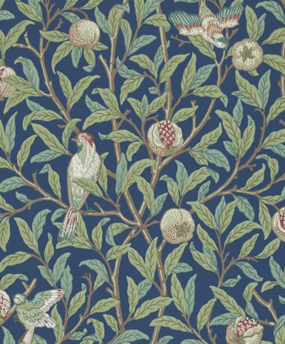
And who hasn't marveled at the subtle finesse of the Morris prints  "Bird and Pomegranate", "Compton", or "Acanthus" which originate from the 1870's?
These classic papers are still available, some with new tweaks. CW Stockwell, for example, is adjusting backgrounds and refining colors to suit today's design aesthetic better.

MARTINIQUE - BEVERLY HILLS HOTEL

MARTINIQUE - BEVERLY HILLS HOTEL

MORRIS & CO

MORRIS & CO

CW STOCKWELL

CW STOCKWELL

PAULA INTERIORS PROJECT

PAULA INTERIORS PROJECT

But the new papers are also full of textures. Grasscloth works across most design styles. Working with a designer to find the perfect backdrop for your room's style will ensure that the look and feel of your room matches your vision.

We all remember, too, the trays of sticky, murky water, the "discussions" between the people actually doing the work and all prefaced by the hours of steaming and scraping the old paper off the walls. New papers go up easily, come down easily, and some are reusable --  all of which means that homeownership doesn't limit where these papers can contribute to a design style. 

And contribute, they do. In fact, they can be the boss of the design style;  Martinique, for example, sets the tone for a room and anything in that room better measure up.   We said "comfort" is the word for the year. Let's add to that if you step outside your comfort level, just a bit, and do even one wall in 'spectacular.'

Talk to you soon,

Paula R  


Why You Should Consider Custom Furniture

The furniture you choose can have a huge impact on any room design. Whether you live in a tiny condo or a large home, a custom piece of furniture is an excellent way to personalize your space. It’s also sometimes the only way to get exactly what you want.

CENTURY FURNITURE

CENTURY FURNITURE

Custom Furniture Fits

Designing for smaller or oddly-shaped spaces is difficult, especially if you are relying on traditional mass-produced furniture pieces. When you buy a custom piece, you can have it made to fit the space that you live in. While traditional furniture can be modified, it’s often less expensive to have the piece made for your space from the beginning - something that many homeowners find quite surprising.

And it’s not just size. It’s often hard to find a mass-produced piece that exactly fits your vision of a space. Usually something is always just a bit off; whether it’s the materials, the color, or the size, it can be hard to find a traditional piece that is just right for what you want.

Versatility

Custom furniture is very versatile. Need some extra storage? Have a custom bench, ottoman, or even sofa made. Extra storage can be incorporated right into the piece. Need a bookshelf that features a few adjustable vertical shelves? A custom furniture maker can do that for you. It’s a great way to ensure you get exactly what you need.

BAKER

BAKER

Quality

Custom furniture is often much higher quality than mass-produced features. Because your piece isn’t being made on an assembly line, the maker can create your piece out of whatever materials you choose - including higher quality materials than you’d normally find in a furniture factory. Of course, higher quality materials also means that your custom furniture will last much longer than a piece that’s been mass-produced in a factory - which brings us to our next point.

Value

One thing that trips many people up when they’re shopping for custom furniture is the cost. While the initial price can sometimes cause a bit of sticker shock, this can always be lowered based on the materials you choose. It’s also very important to remember the value that you’re getting. When you order a custom-made piece of furniture, you’re getting exactly what you want and expect. You’ll get to choose the dimensions, shape, features, and even materials that your piece is made from. So, yes - it may initially be more expensive than a mass-produced piece of furniture, but it will also carry more value. It will be made exactly for you and the space you’re creating.

So the next time that you’re looking for the perfect piece to fit your newly-designed living room or bedroom, consider ordering some custom furniture instead. Not only will you be pleasantly surprise at the many options available to you, you’ll be happy with the quality and value that you’ll get as well. A custom-made piece is something you can keep for years - and there’s nothing quite like seeing something that was made especially for you and your space every day.

Talk to you soon,

Paula R


6 Easy Kitchen Updates That Make a Huge Difference

After

After

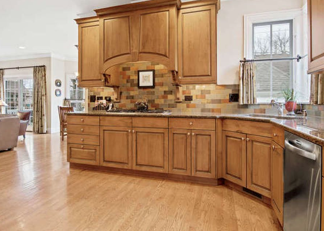
Before

Before

Tell someone you’re updating your kitchen, and you’ll likely be met with shocked stares. Many people are intimidated by the idea of a kitchen renovation. It tends to conjure up images of endless construction, constant mess, and weeks or months of take-out dinners. But making a change in your kitchen doesn’t have to be a long, drawn-out process. In fact, you might be surprised at how much of a difference some small, easy changes can make.

1.Install a Backsplash: One of the easiest changes you can make in your kitchen can also make the biggest difference. Installing a backsplash not only creates a great focal point; it lets you express your unique style and personality as well. Whether you choose subway tile for a clean, modern look, or a colorful mosaic of tile, a custom backsplash can change the entire feel of your kitchen.

2.Remove Your Cabinet Doors: Removing your cabinet doors to create open shelving is an excellent way to lighten a heavy-feeling kitchen. In a smaller space, remove only one or two cabinet doors, and use the space to showcase eclectic, attractive, and colorful pieces that you love. Dishes, attractive glassware, and even dry goods stored in attractive glass jars all make excellent displays for open cabinets.

3.Replace Your Countertops: This change is easier and less expensive than you think. Swapping older stone countertops for new marble or quartz countertops are an excellent way to update your kitchen. For a few hundred dollars, this one small change can completely transform your kitchen - making even the most ordinary kitchen space into something you’ll want to show off.

4.Swap Out Your Hardware: Sometimes all it takes to change the look of your kitchen is a hardware update. Swap out outdated drawer pulls and cabinet knobs to give your kitchen a fresher look. Not quite enough? Consider painting your cabinets to really change the feel of your space.

5.Accessorize With Small Appliances: Toasters, stand mixers, and many other small kitchen appliances aren’t just functional must-haves. Many of these gadgets come in bright colors or with fun designs. Swapping out your old, dull pieces for newer, more fun gadgets can be a great way to show off your personality and sense of style.

6.Update your fabrics: This can be one of the best ways to change the feel of your kitchen. Hanging new window treatments, a rug in front of the sink, and swapping out your tablecloth or placemats can really change the look of your kitchen. The best part? It’s easy to rotate through various looks as often as you like!

For many families, the kitchen is the heart of the home. If it’s out of sync with your style, the whole house can feel off. Luckily, changing the feel of your kitchen doesn’t have to be difficult. With just a few small changes, you can update your space and create a kitchen that you’ll love to cook in.

Lets start creating,

Paula R